Written by
Exterior
Before
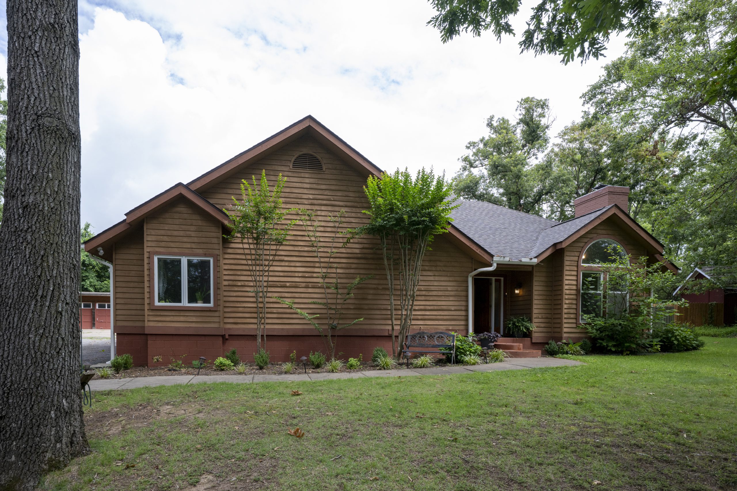
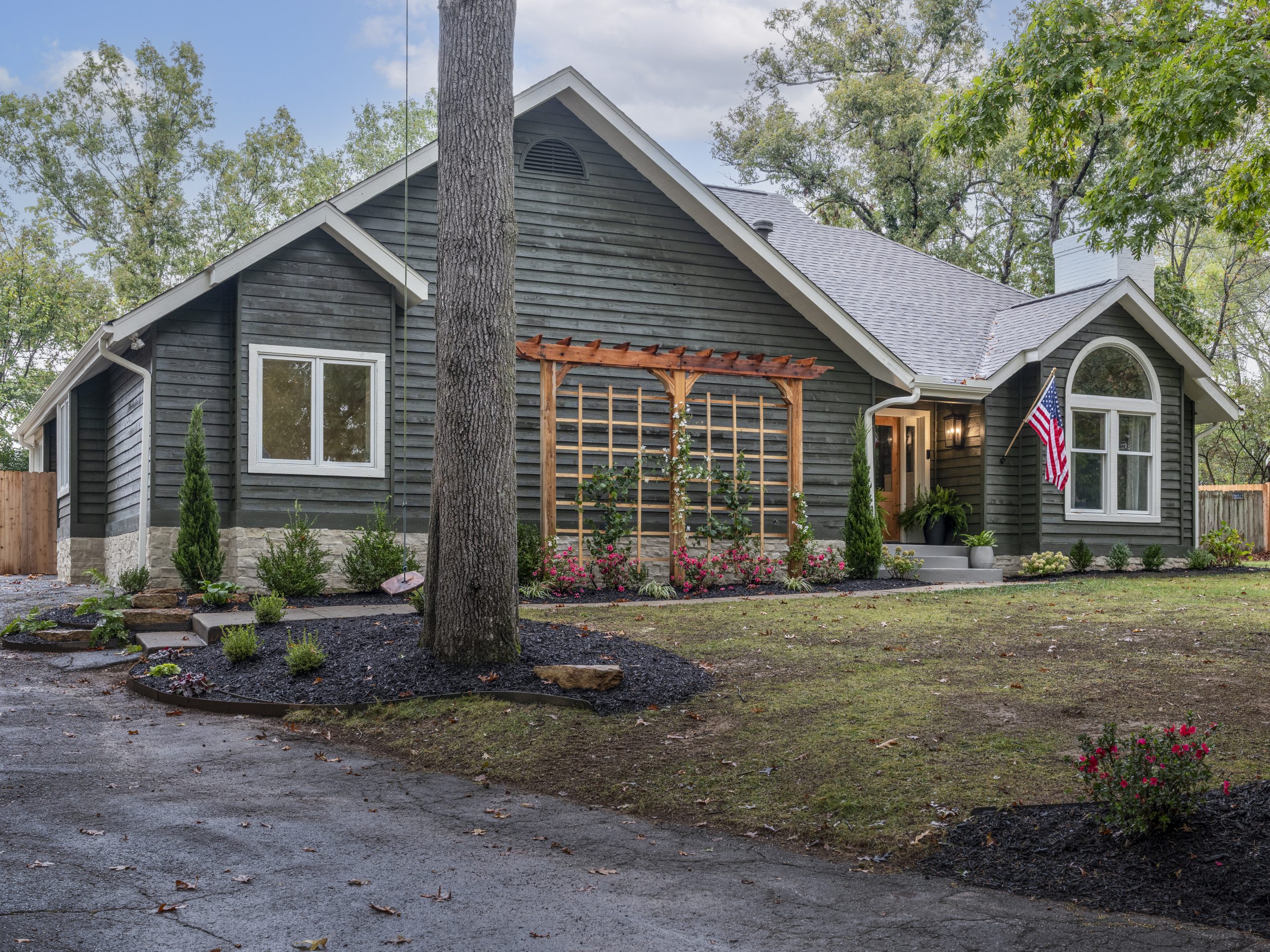
When we drove up, the first thing we saw was a very unique house set among beautiful, mature trees. It had so much potential, but the exterior definitely needed a refresh. The exterior color was an outdated orange-toned terracotta, and the brick along the bottom didn’t blend with the natural surroundings. There was also a large wall of siding at the front that felt asymmetrical and a bit odd, so we knew we wanted to break that up.
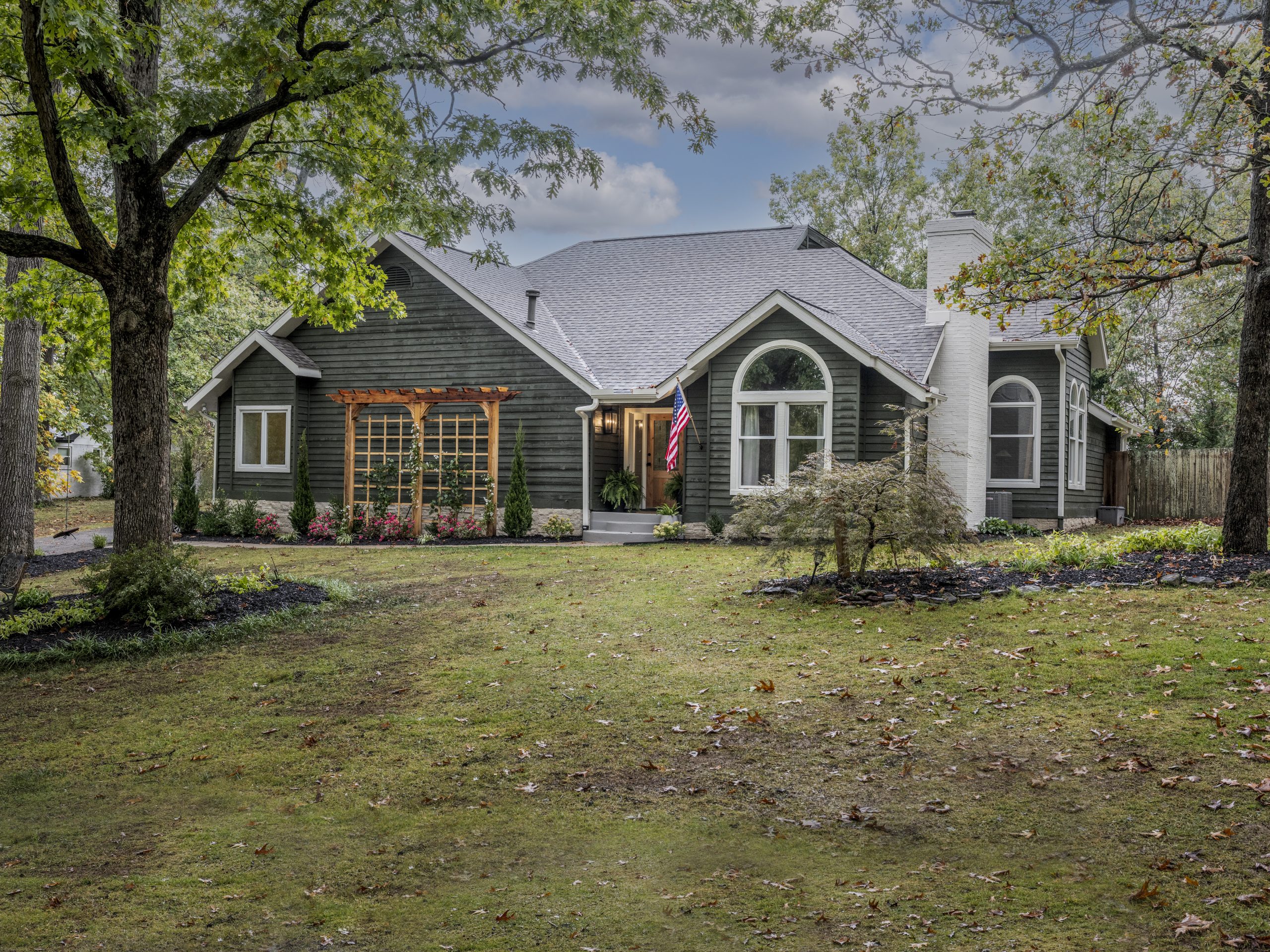
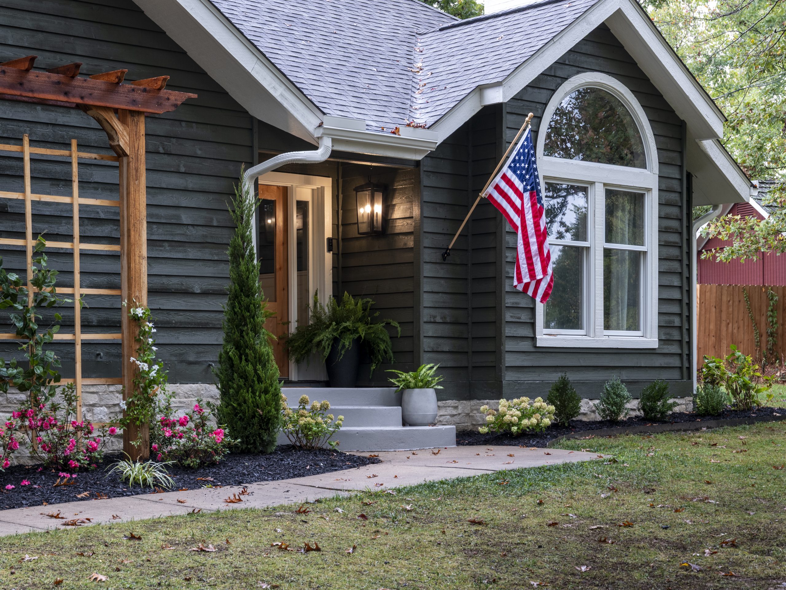
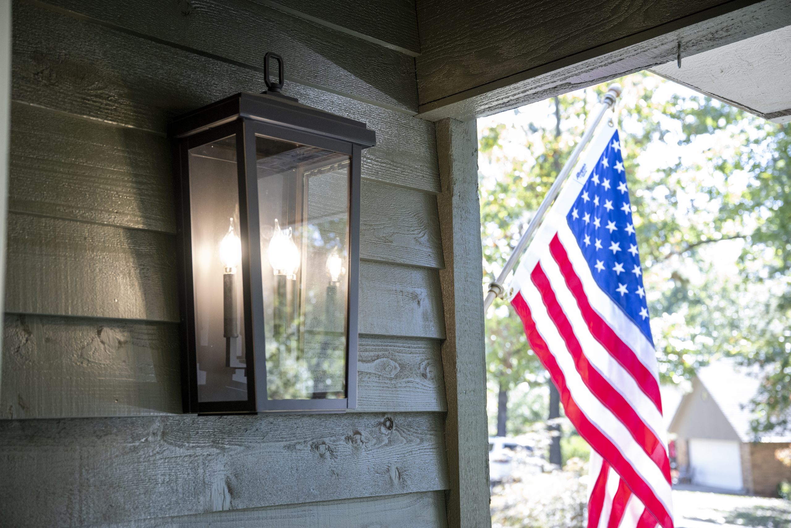
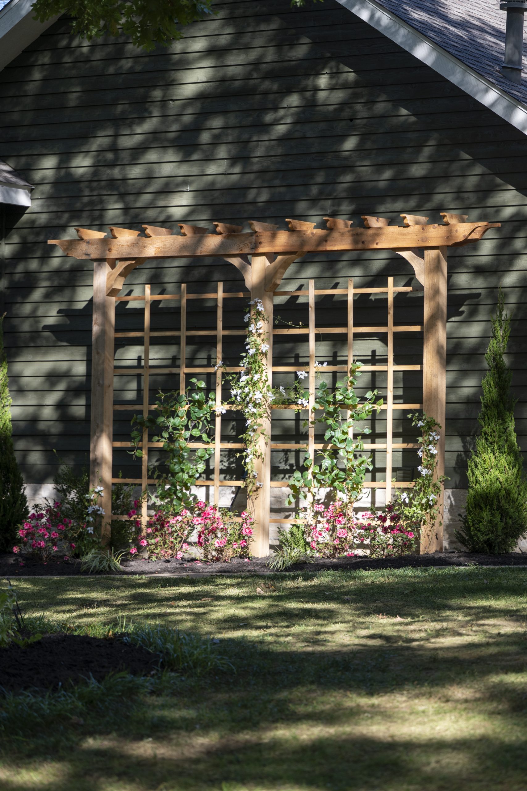
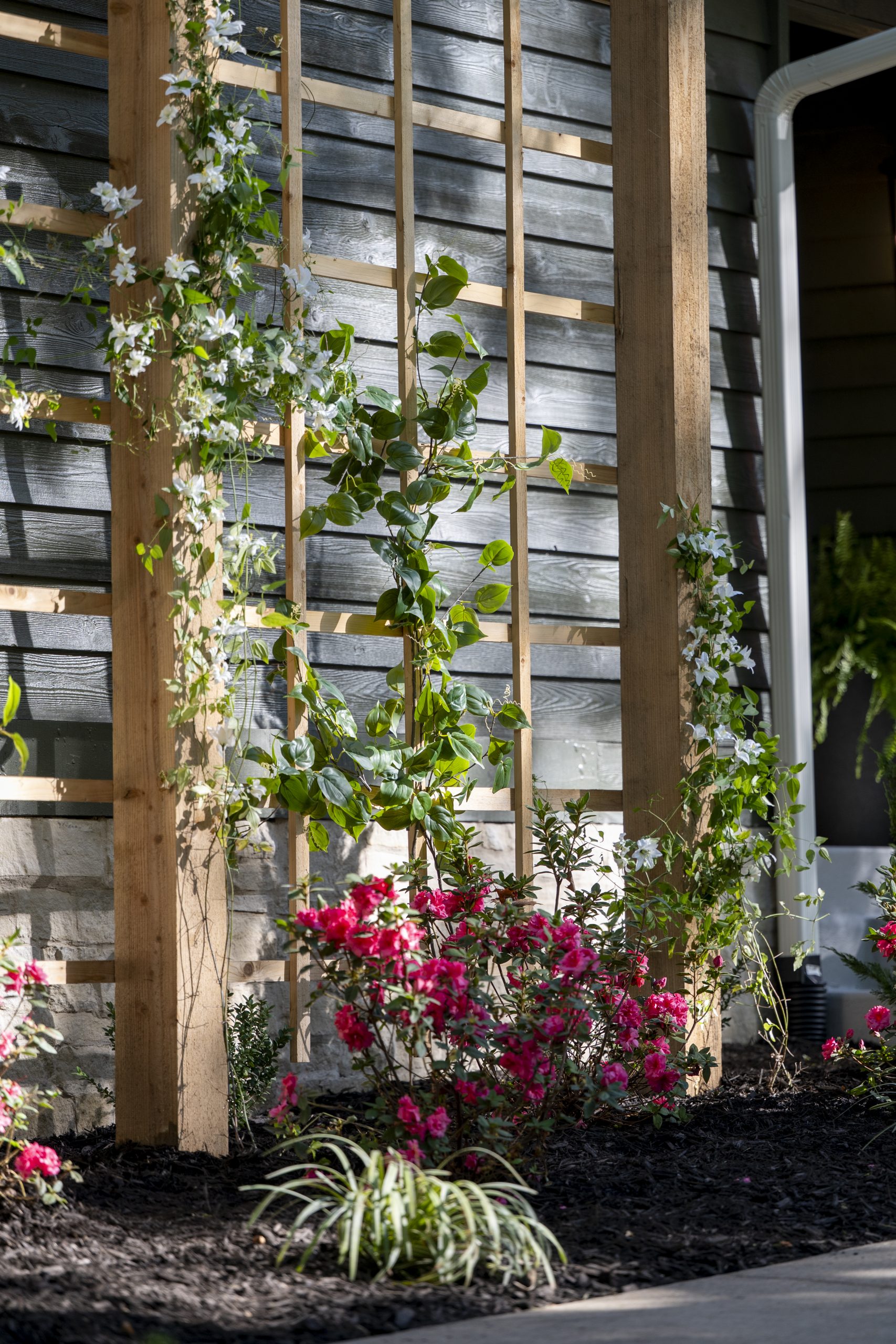
Renee told us she wanted the outside of the house to look more modern and natural, ideally in a darker color. We went with a shade of green on the cedar walls and added stone over the brick to tie in with the house’s natural surroundings. To break up the large, awkward wall at the front, we installed an arbor that adds visual interest and brings balance to the overall exterior.
White window trim, new landscaping, a new front door, and new lighting pull it all together.
After

Sources
Kitchen
Before
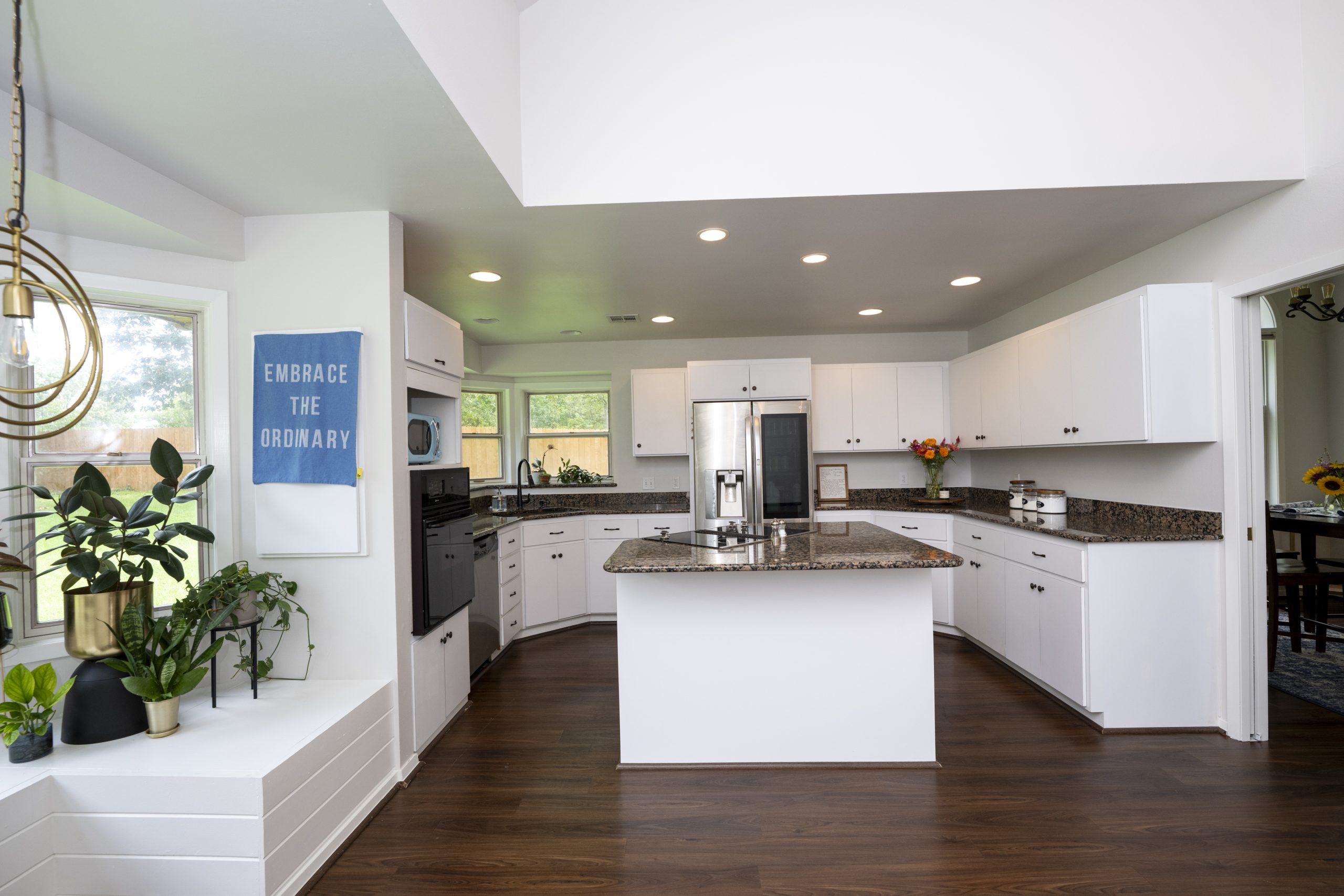
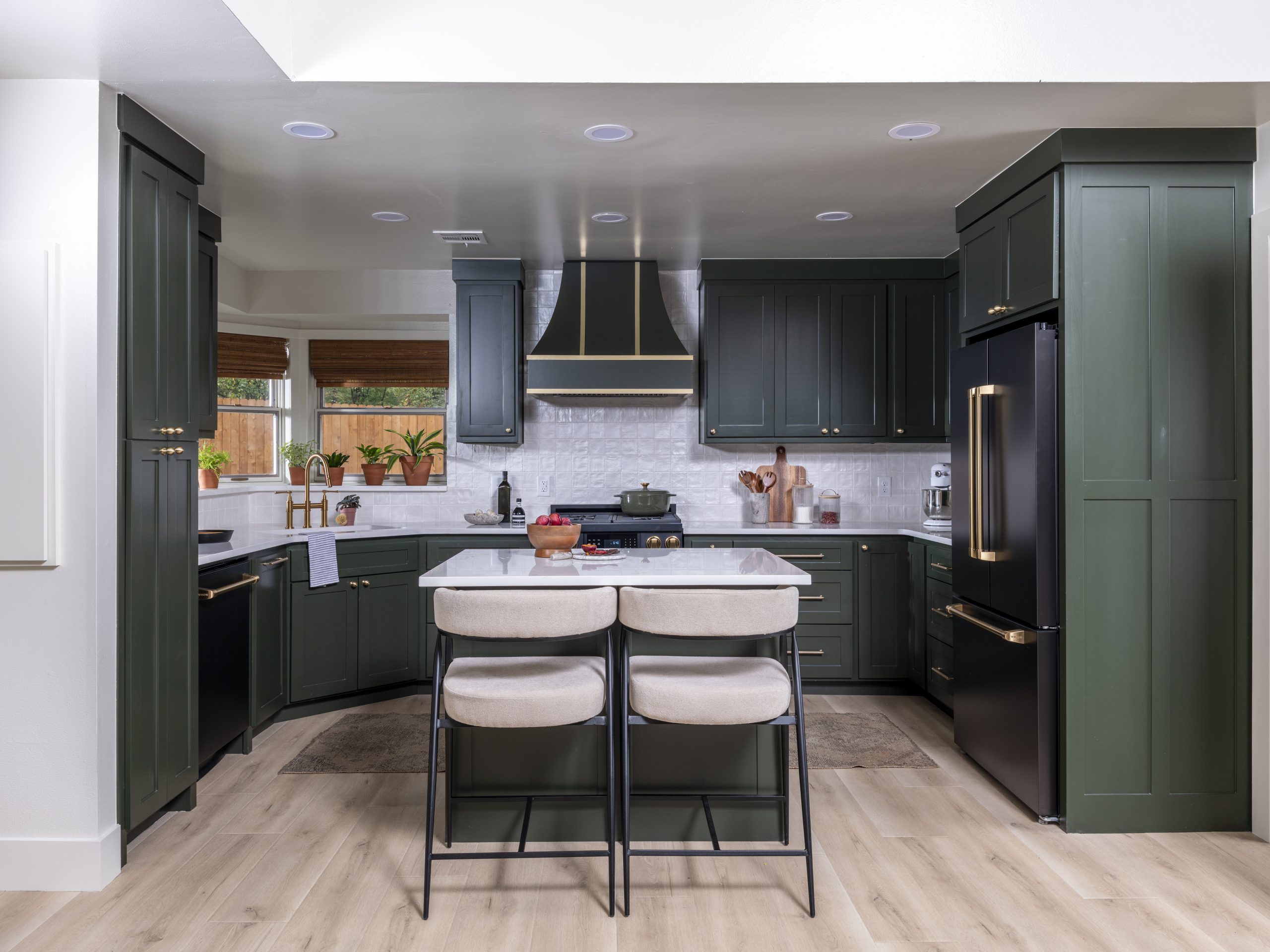
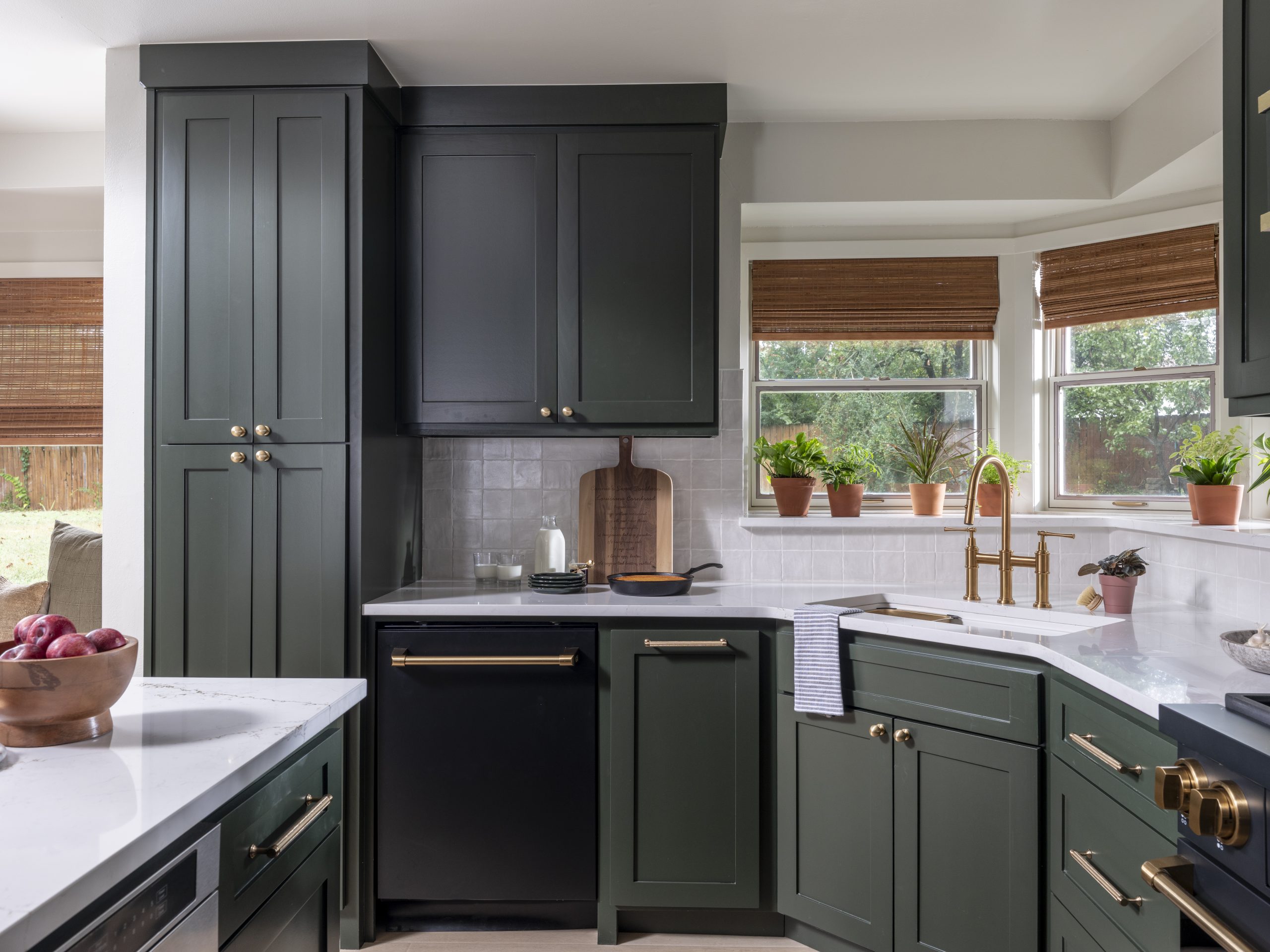
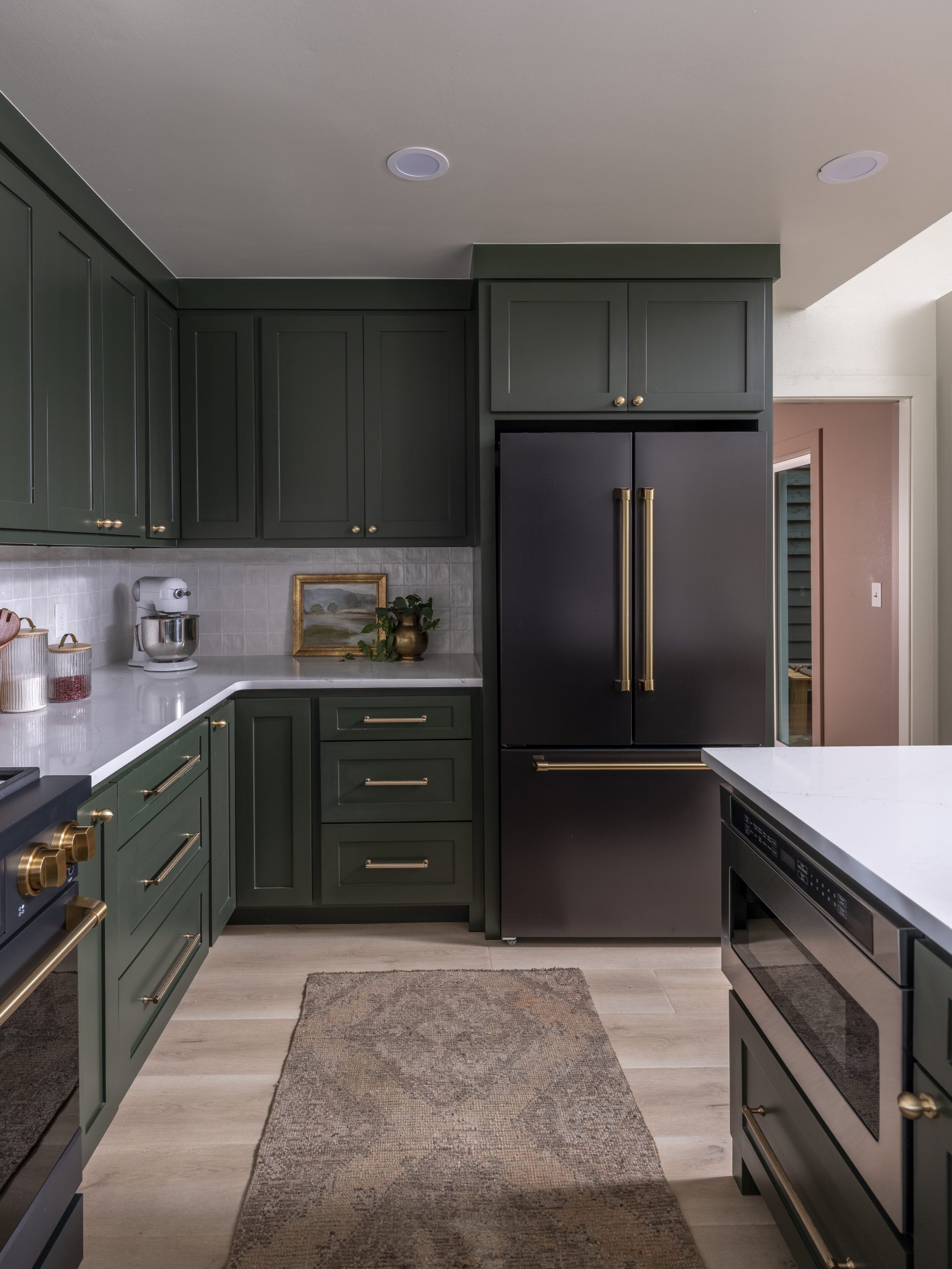
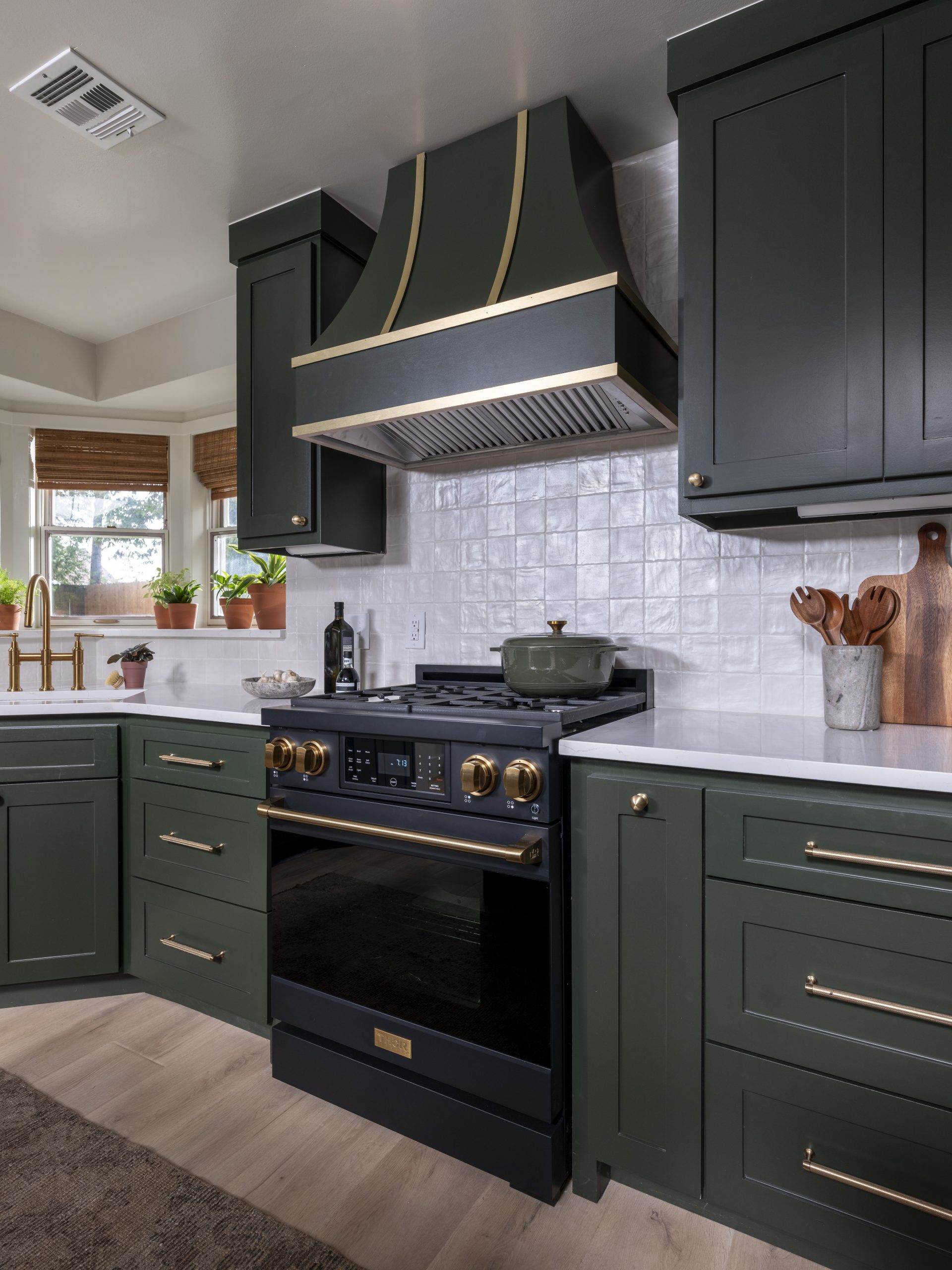
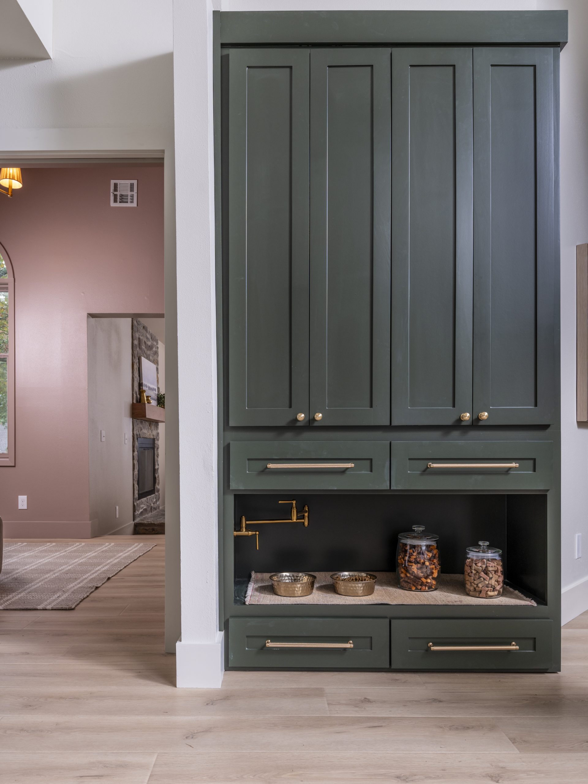
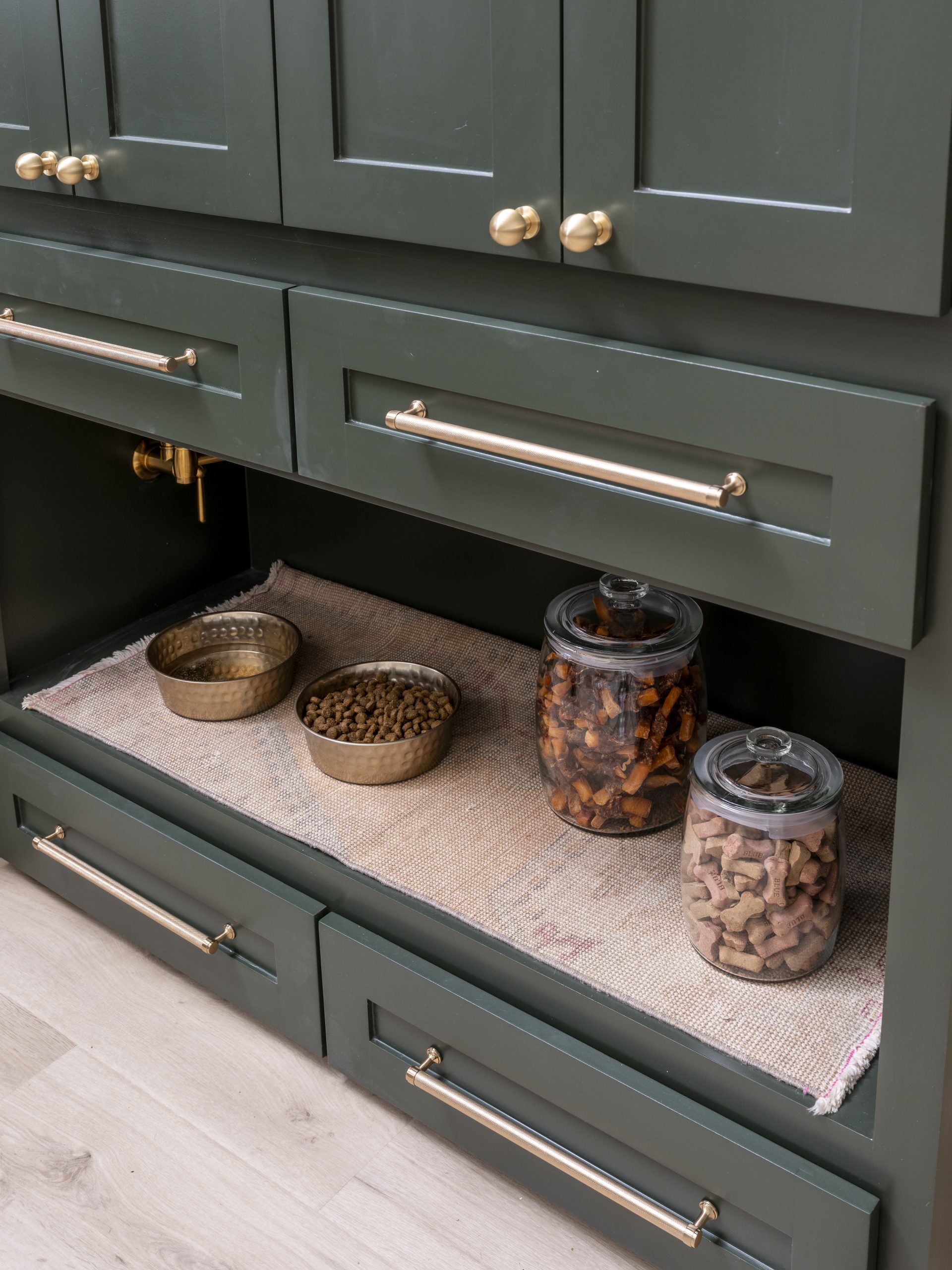
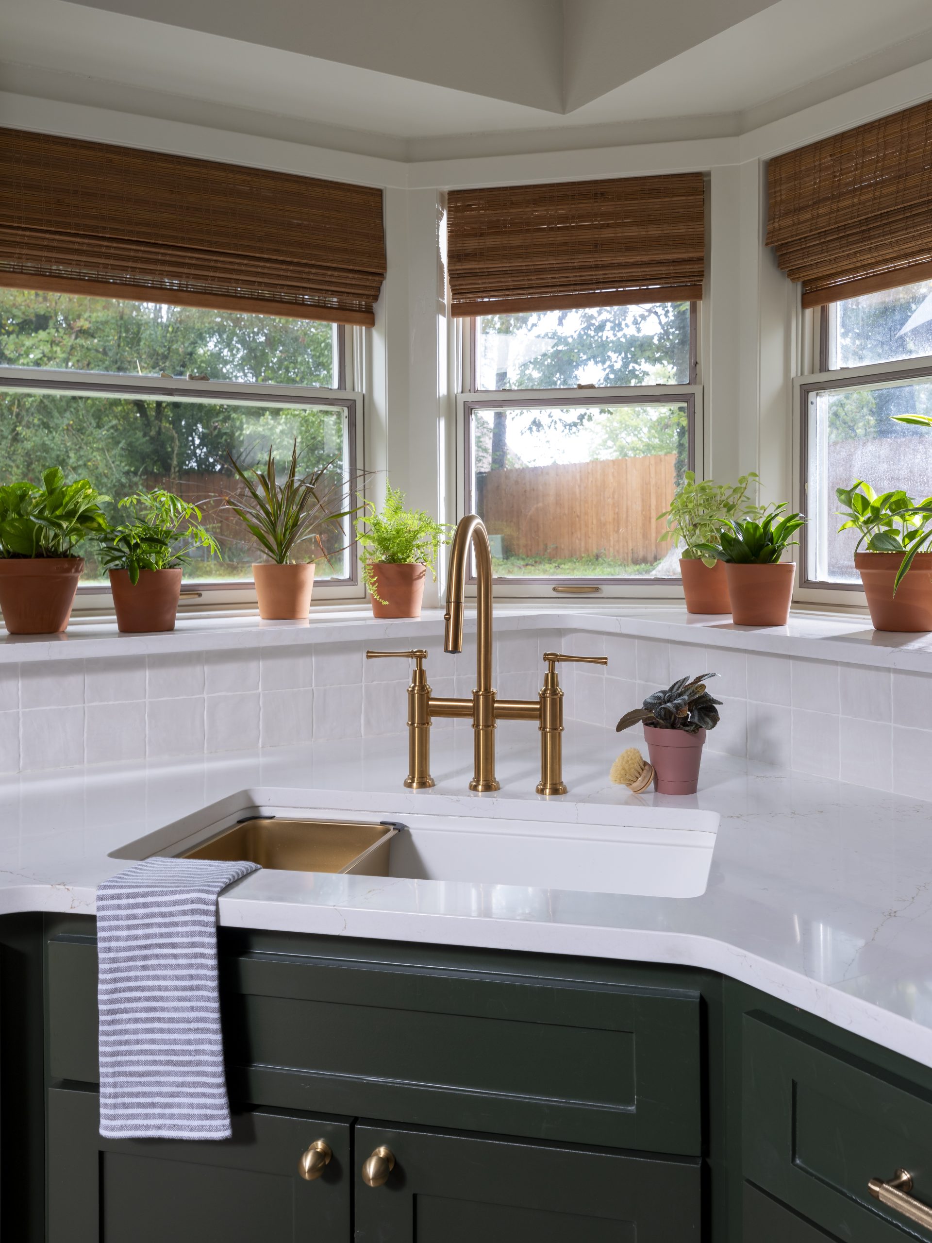
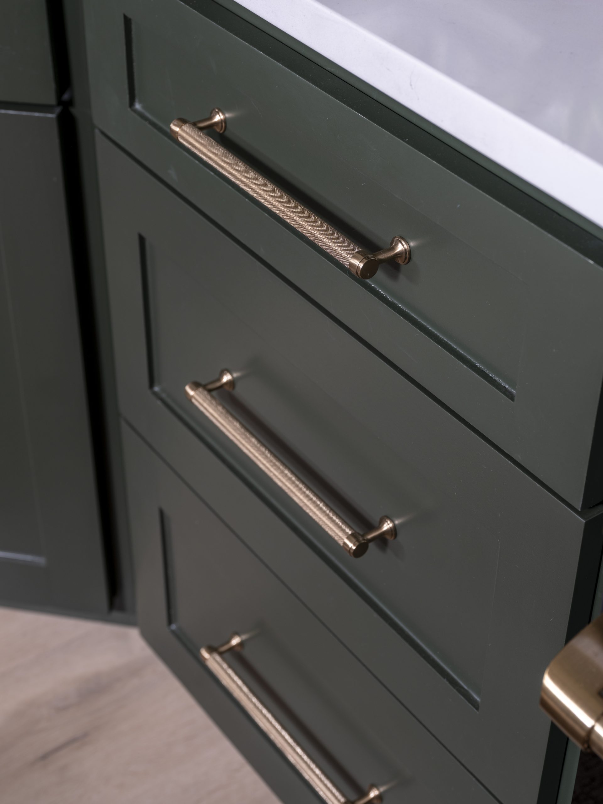
Renee’s kitchen was dated and not functional. It had lots of odd shapes and corners and was missing a pantry. We gutted the entire space and started over with new cabinets, new appliances, and a simpler little island in the center. By closing off an unneeded window, we gained wall space and were able to add a pantry. Renee loved the cute little alcove at the bottom for her puppy’s food and water dish, complete with a working faucet for refilling his water bowl. The rich green cabinets and hood with gold accents contrast beautifully with the white stone-style countertops and soft white backsplash tile.
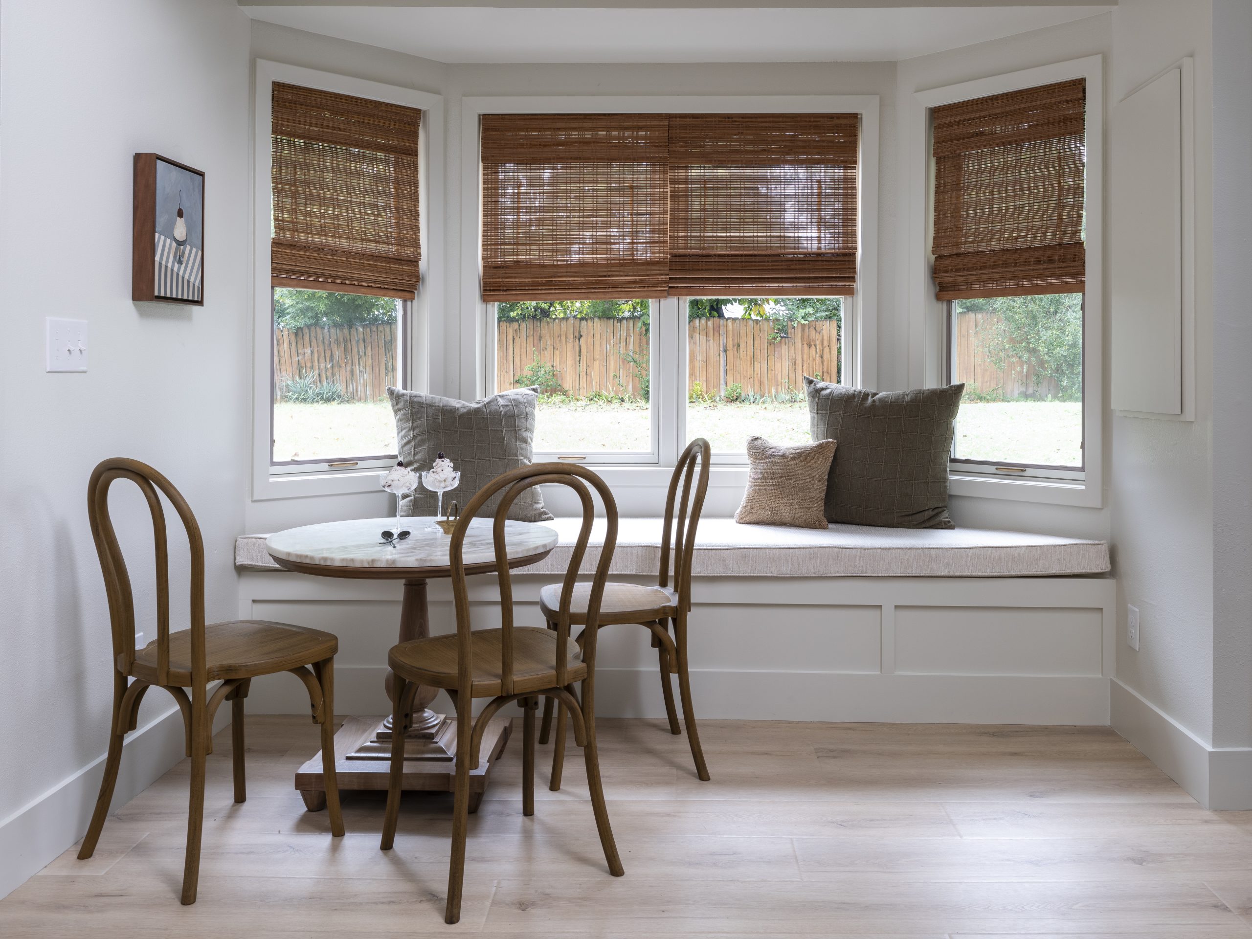
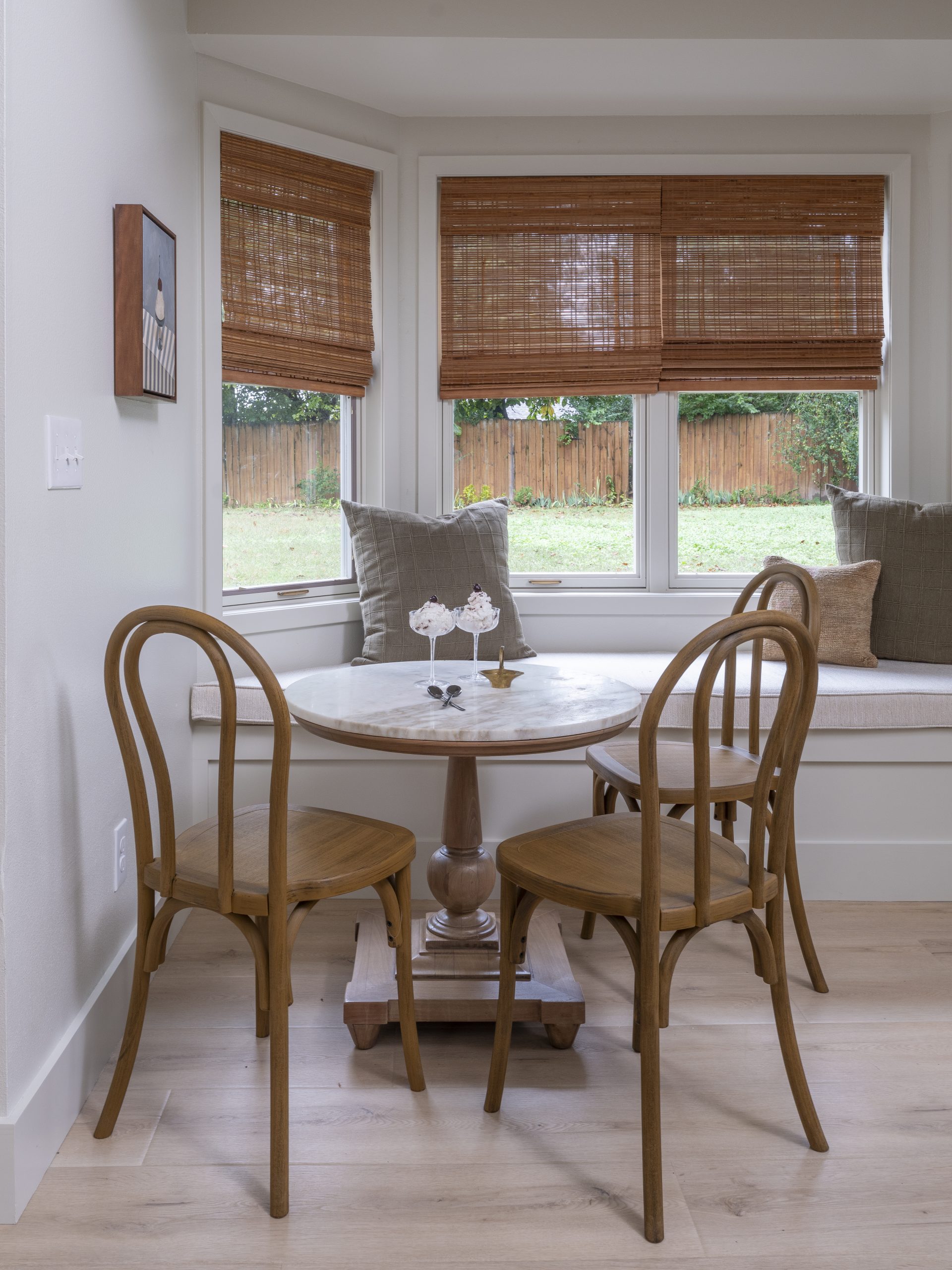
Just off the kitchen, Renee had a large window seat area that was nice but too deep to sit comfortably. We trimmed back the benches to keep just the section directly in front of the window and added a small circular breakfast table.
Dave also carved out a special little gift from us. Renee’s mom has a famous cornbread recipe, so he used his CNC machine to inscribe it onto a wooden cutting board that Renee can display on the counter and always have handy in her kitchen.
After
Sources
Dining Room
Before
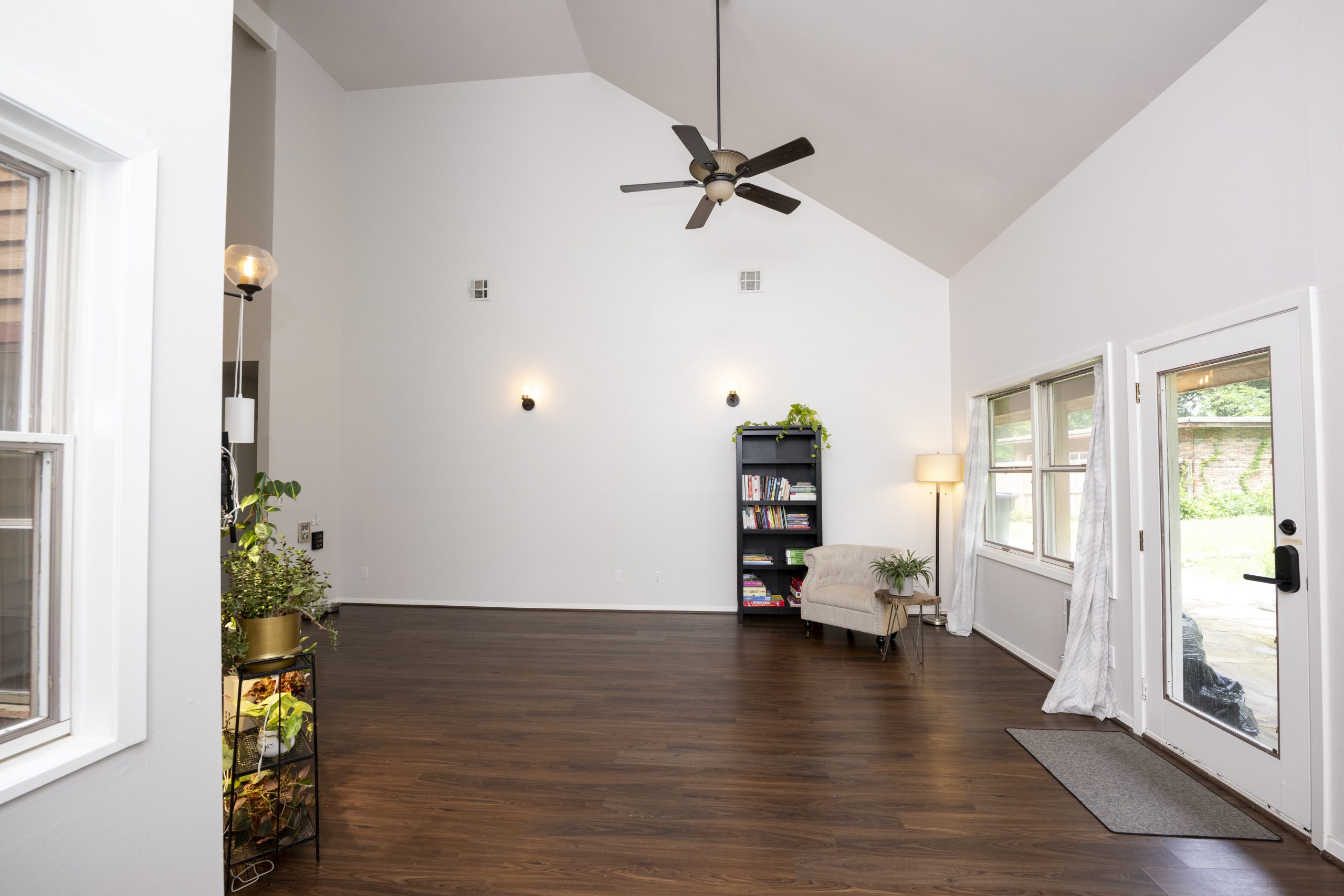
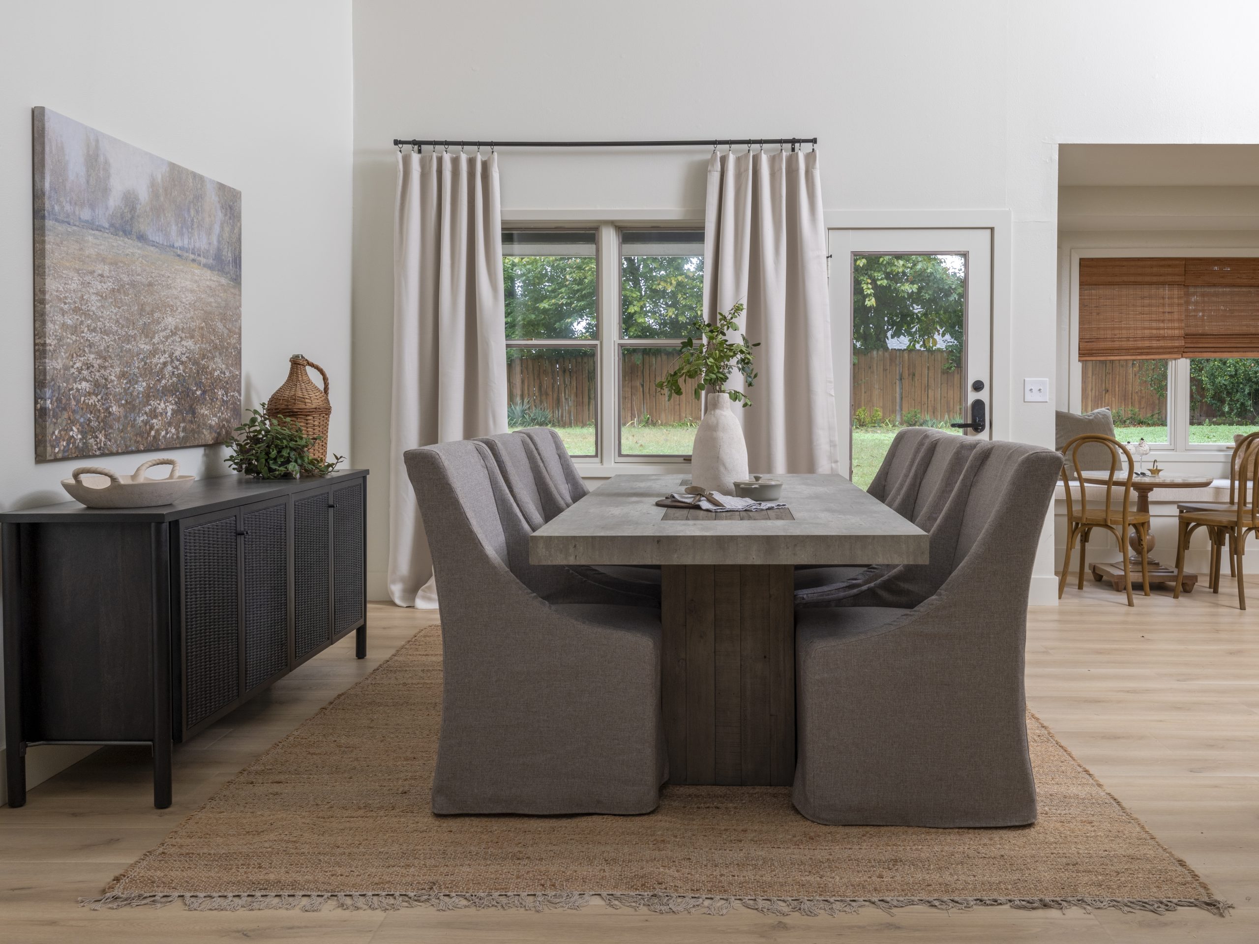
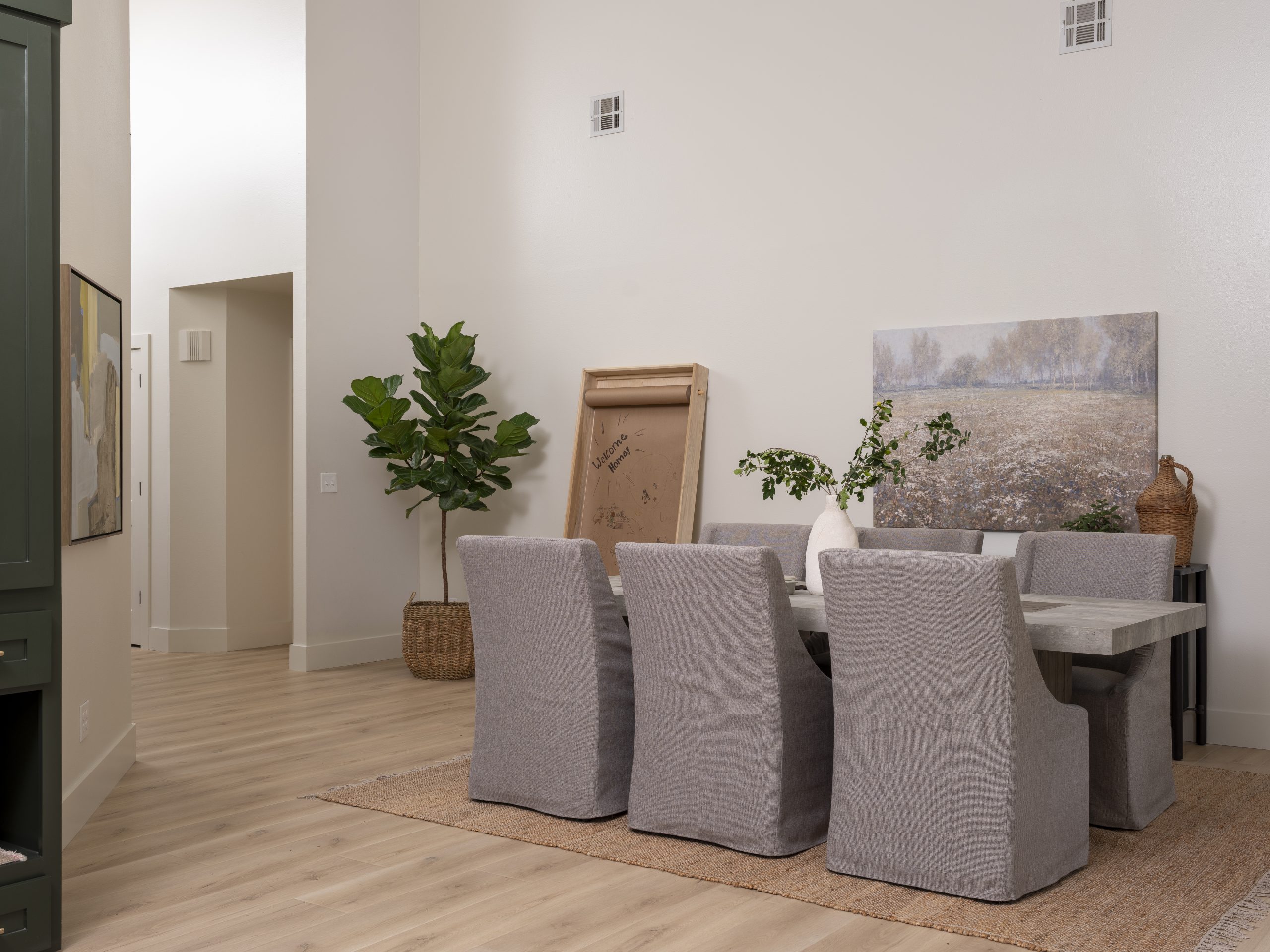
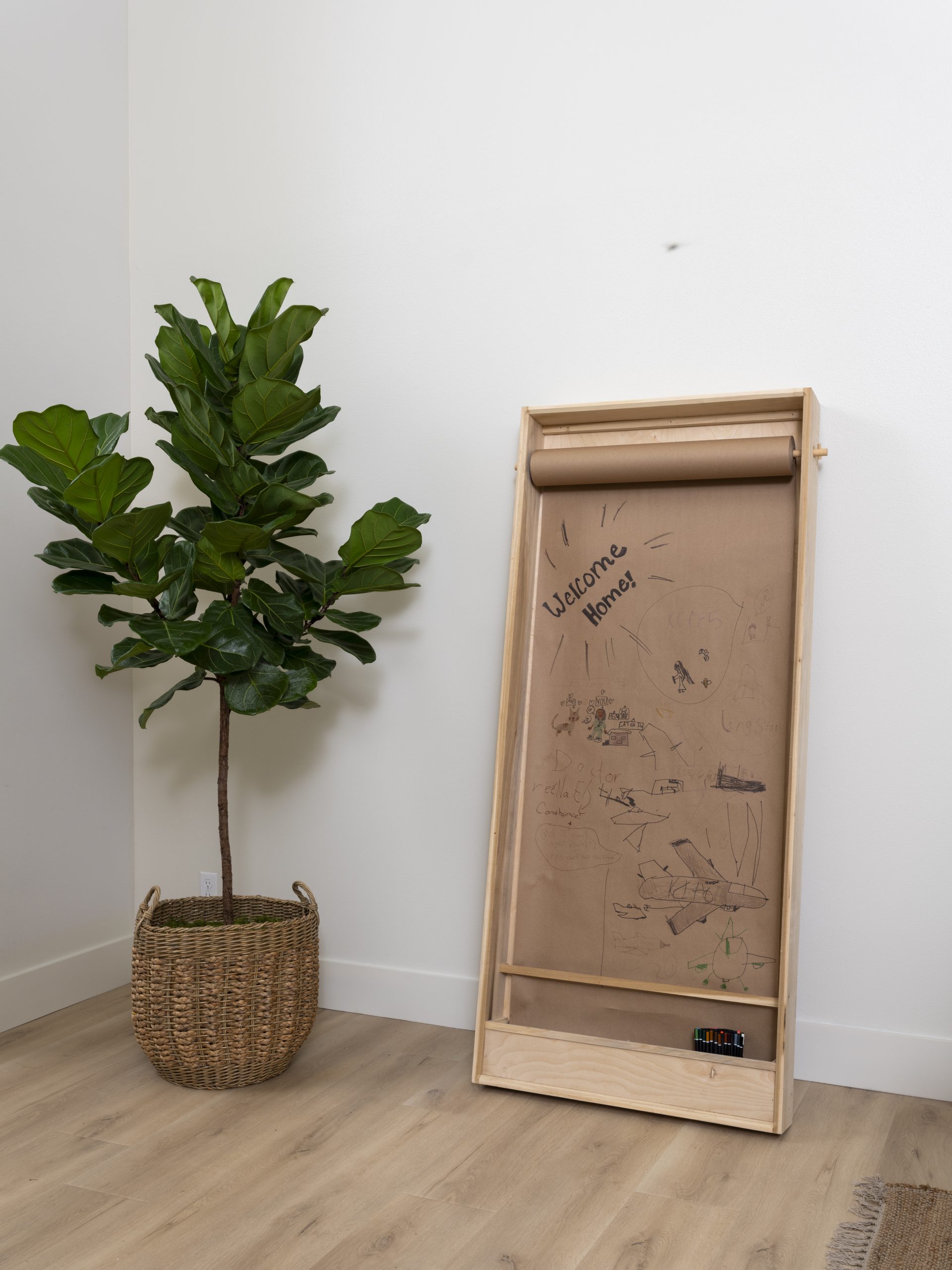
Originally, this was a bonus area that Renee didn’t quite know what to do with. Since we turned the dining room into a library, we moved the dining table here, and it’s now the ideal dining space right off the kitchen. Art on the walls and new window treatments complete the room, while a handmade addition adds some fun. Renee’s niece and nephew visit often, so Dave made them a portable drawing station where they can create art whenever they come over.
After
Sources
Living Room
Before
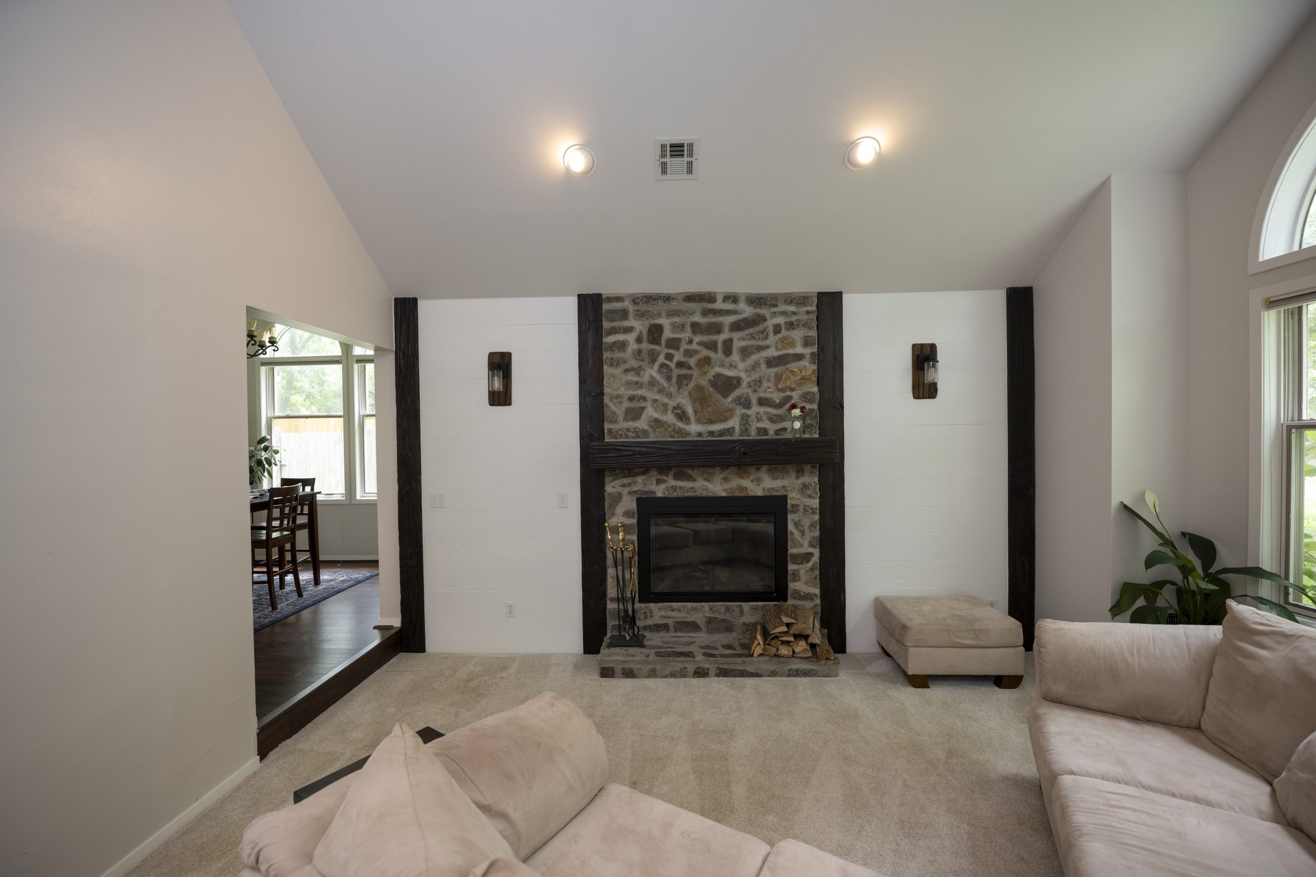
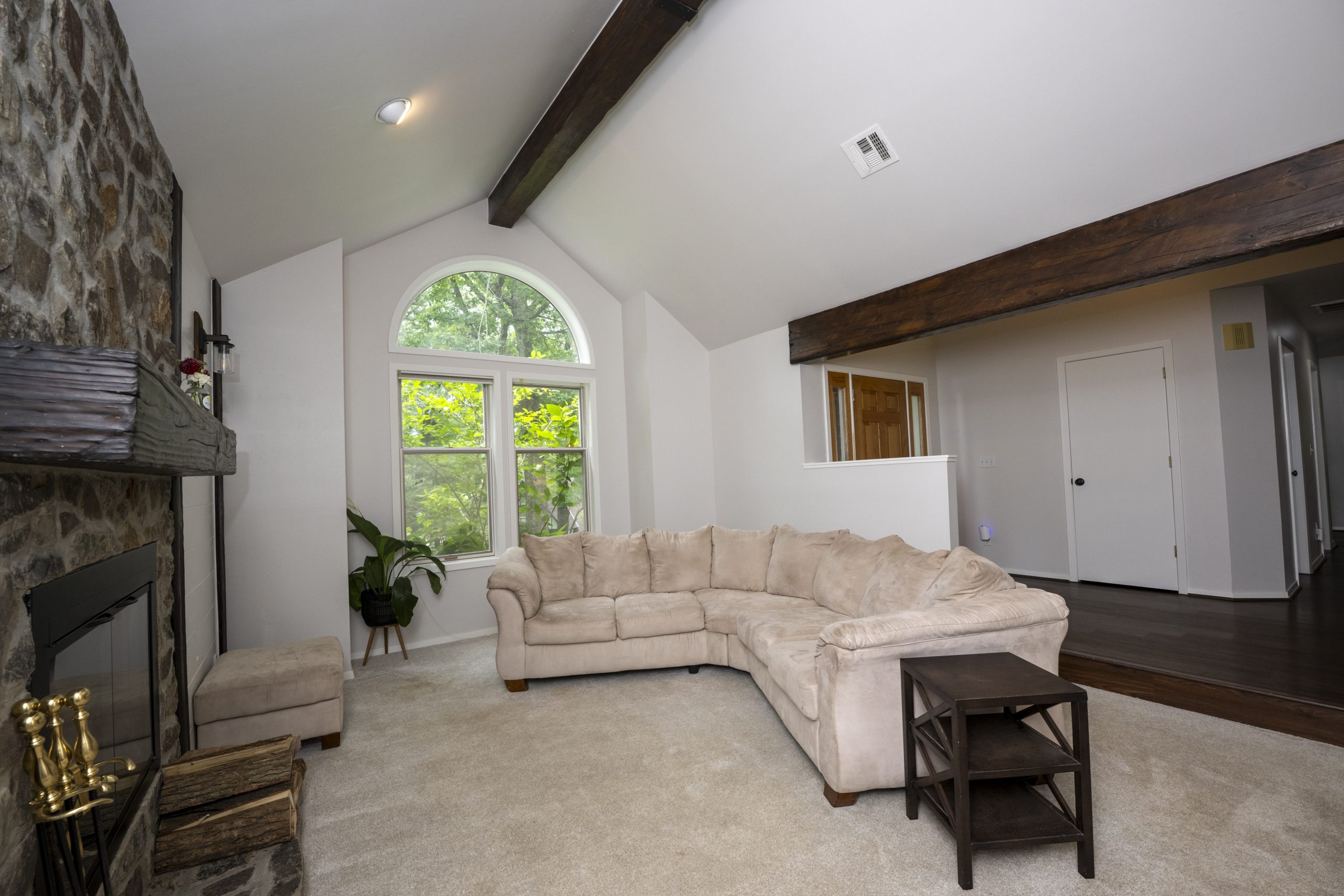
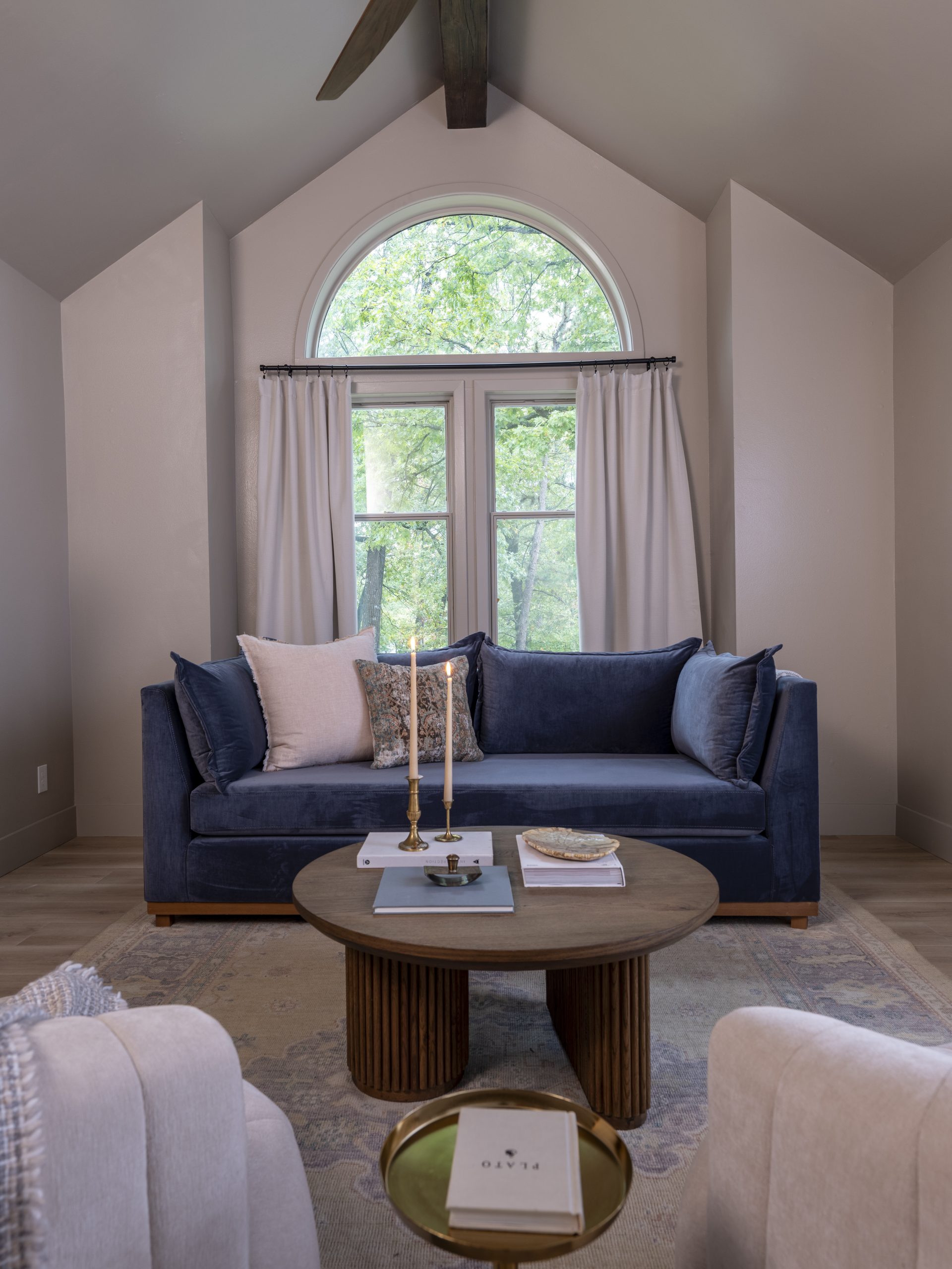
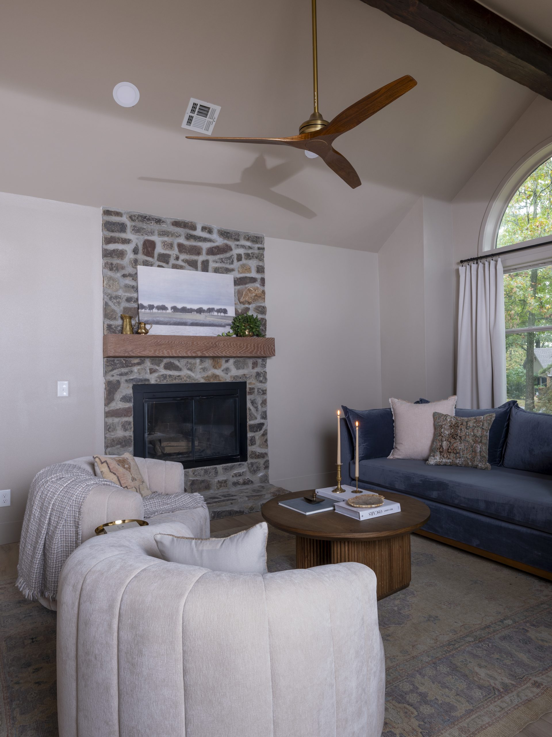
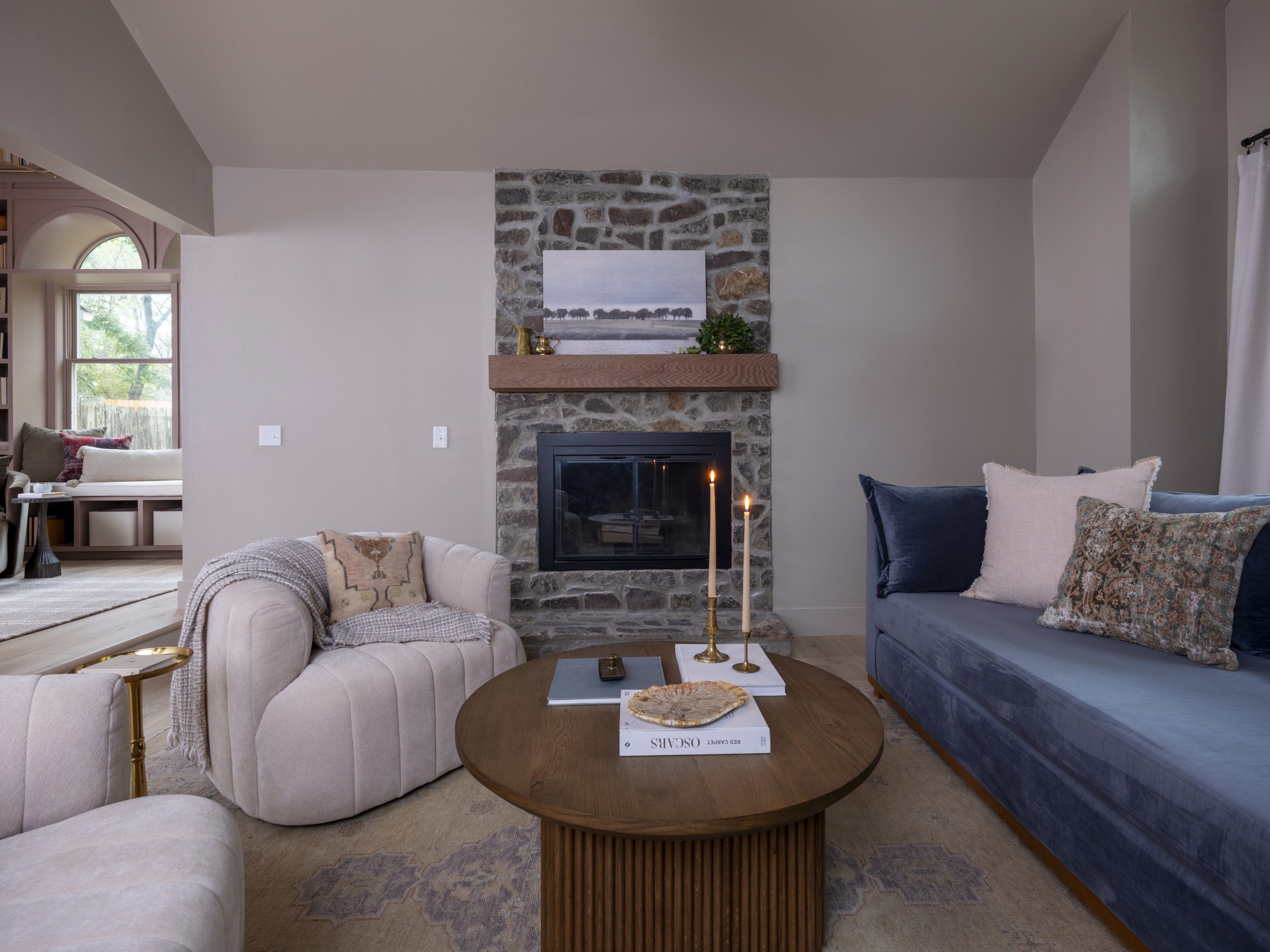
When you walk in the front door, the living room is the first room you see. The shiplap on the fireplace wall did not match the rest of the house, and there was carpet in this room, which Renee didn’t like. Our plan was to replace the flooring, remove the extra elements, and make this a nice, cozy space with the fireplace as the center point. We were able to do that by swapping the oversized sectional for smaller furniture pieces and adding a new fireplace mantel, new lighting, and new LVP flooring throughout the house. Now this room is a great place to entertain and watch movies.
After
Sources
Courtyard
Before
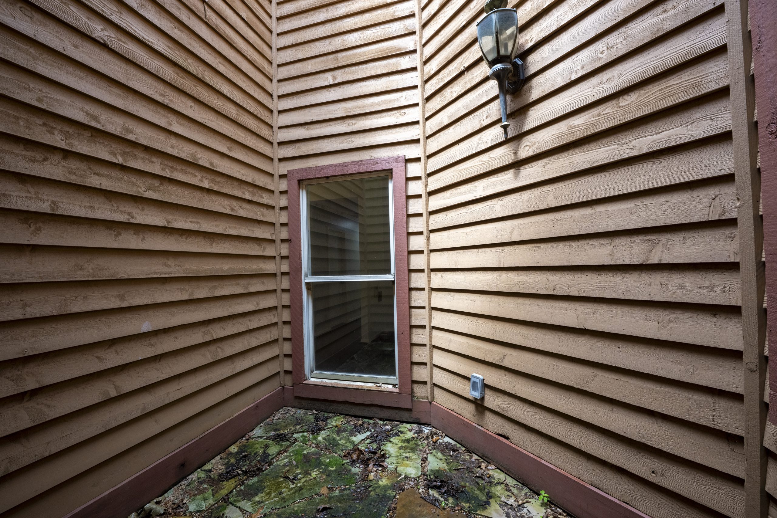
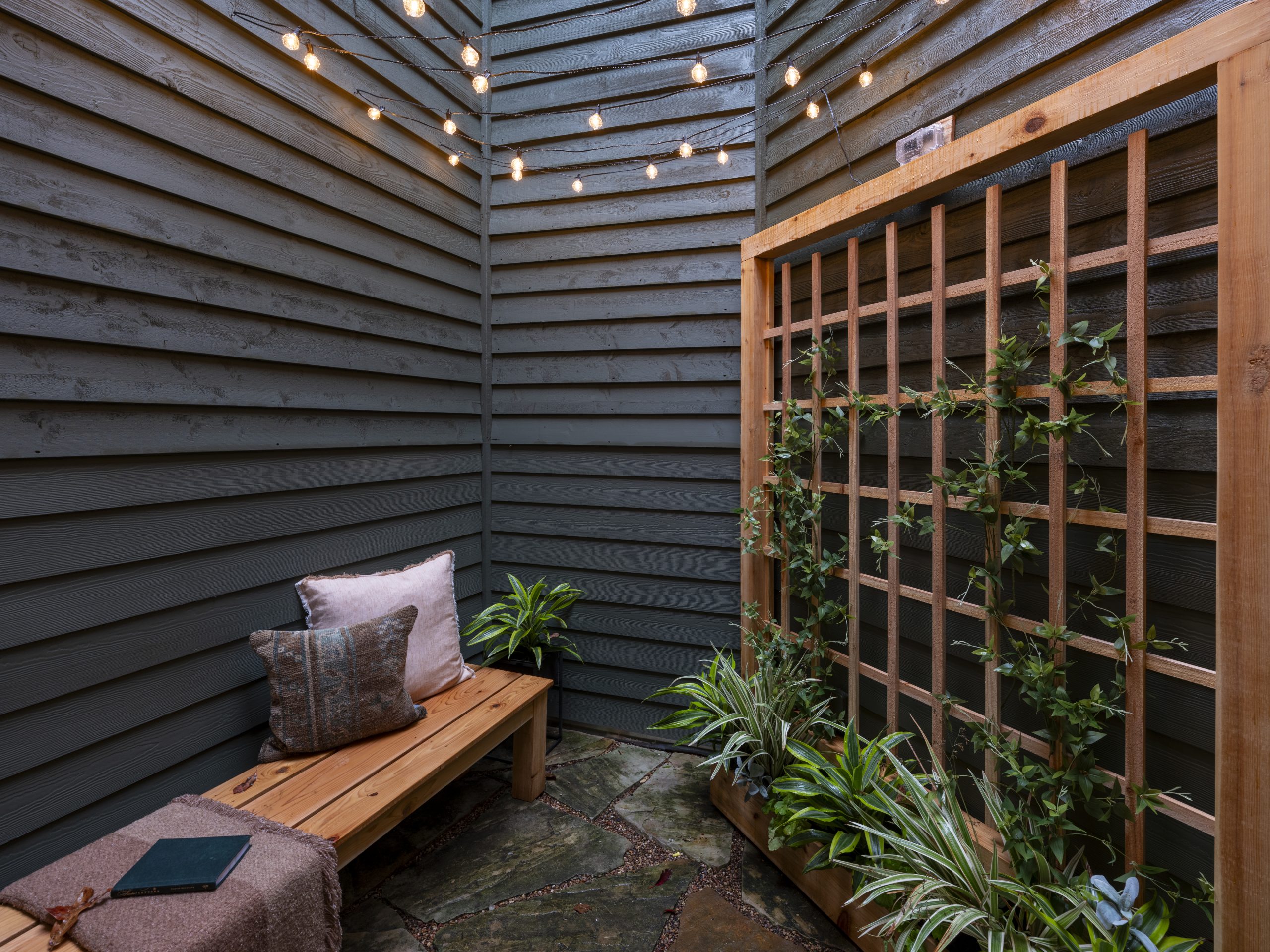
Renee had mentioned that this courtyard was what made her choose this house, so we knew we wanted to do something special here. The problem was that because this little courtyard is open at the top and completely void of sun or wind, it doesn’t dry out very well when it rains. It had become the perfect breeding ground for rot and mold. The windows, especially, had rot all around the frames. Since window frames tend to attract the most rot and these windows didn’t add any natural light to the house’s interior, we decided to remove them. We also installed new waterproof flooring so this wouldn’t happen again.
To make this space into a magical little garden for Renee, we added a wooden bench with a matching wooden trellis, fresh greenery, and cute hanging lights.
After
Sources
Library
Before
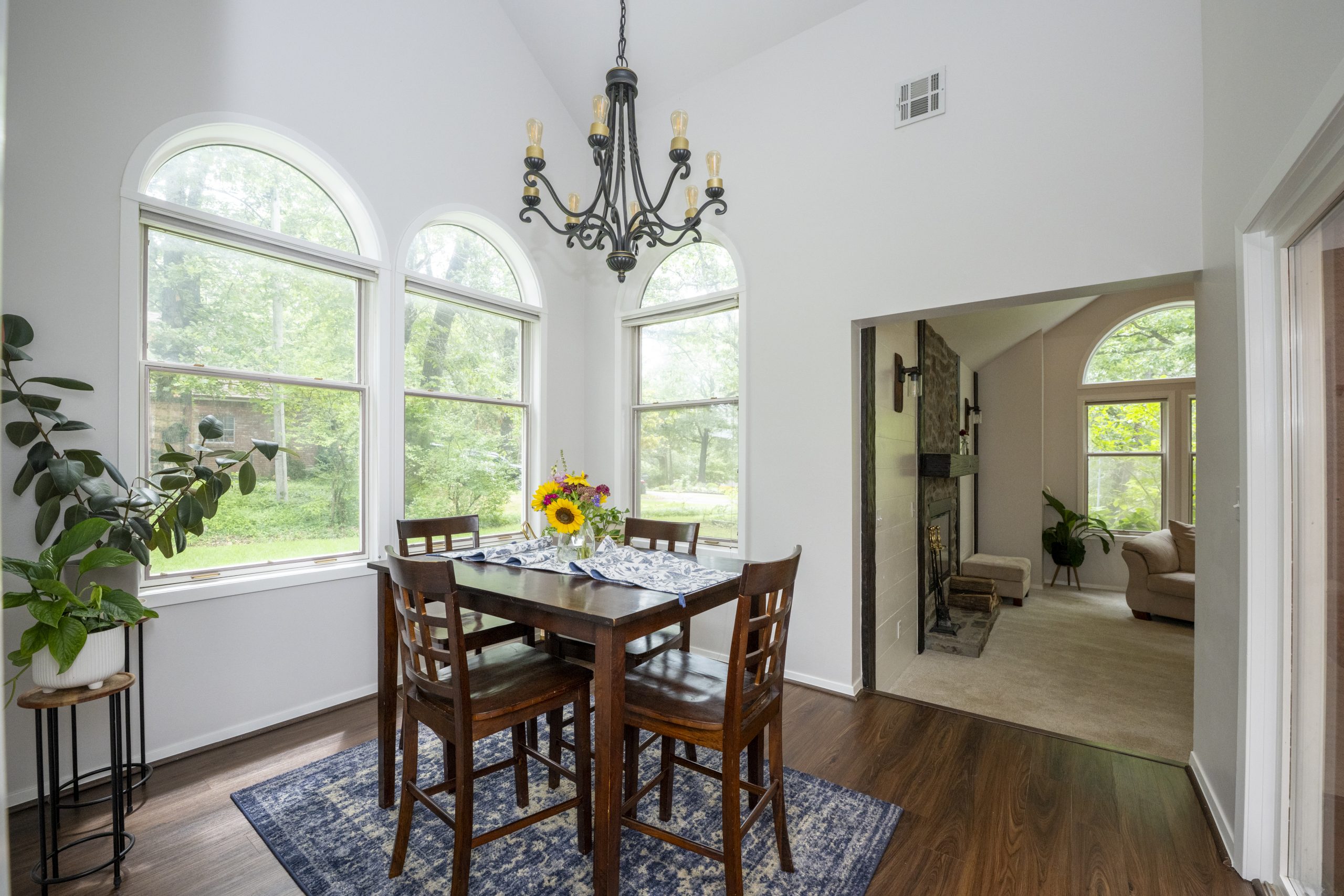
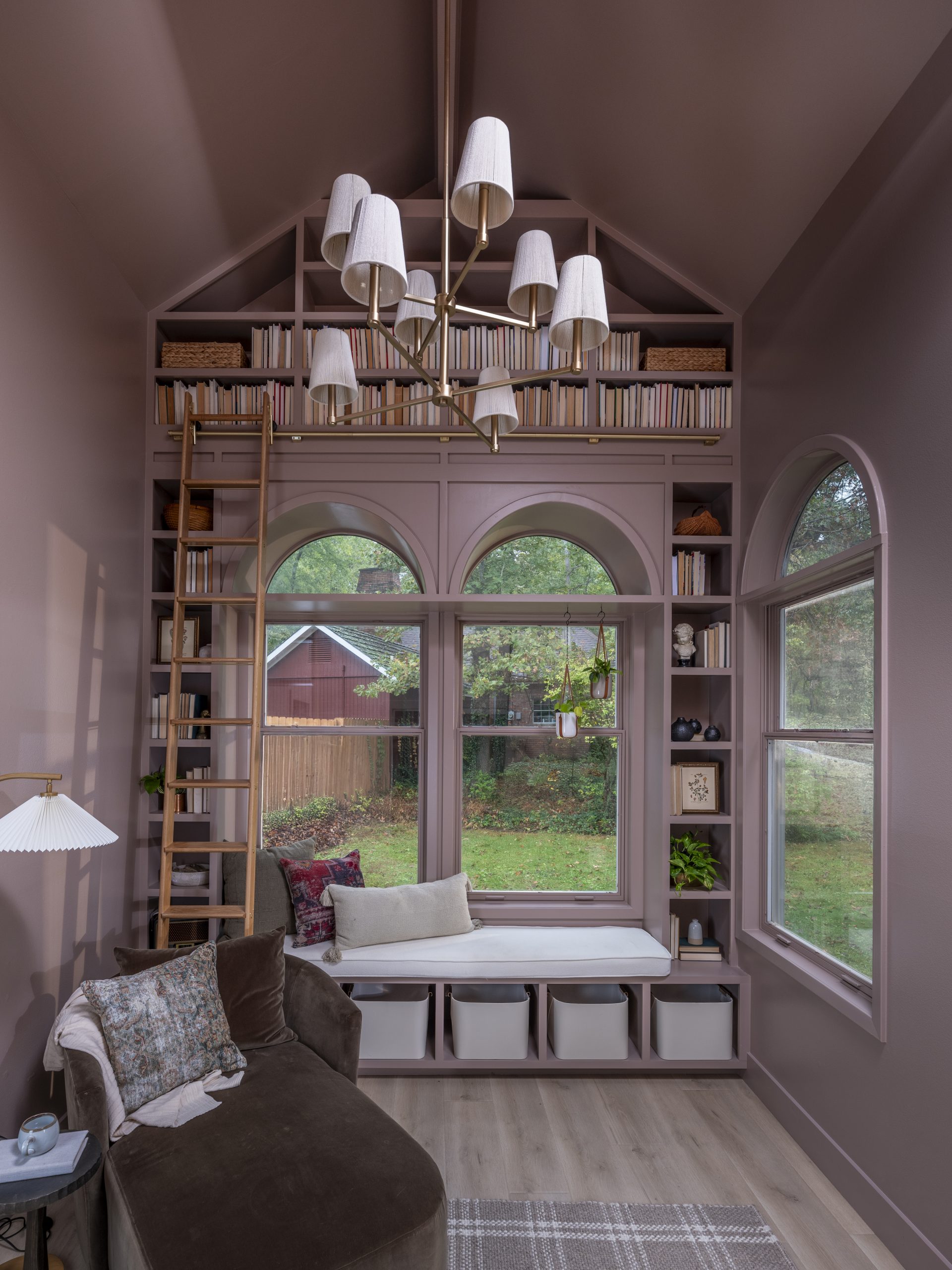
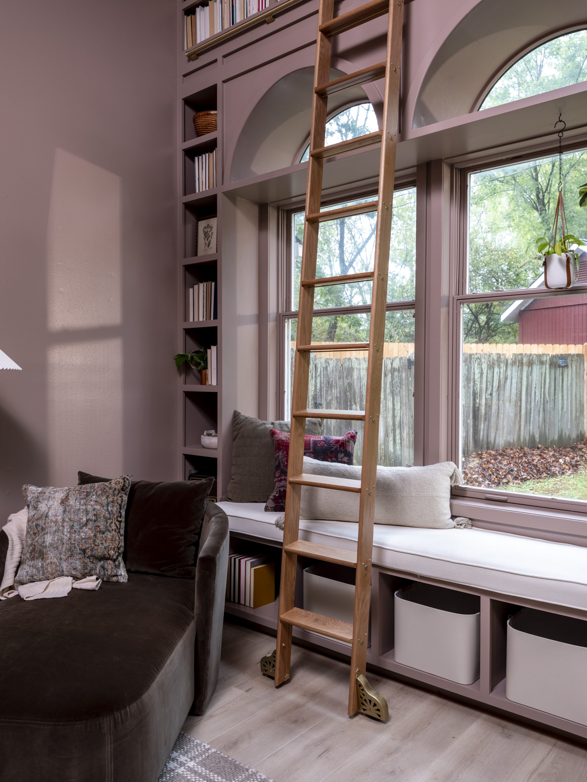
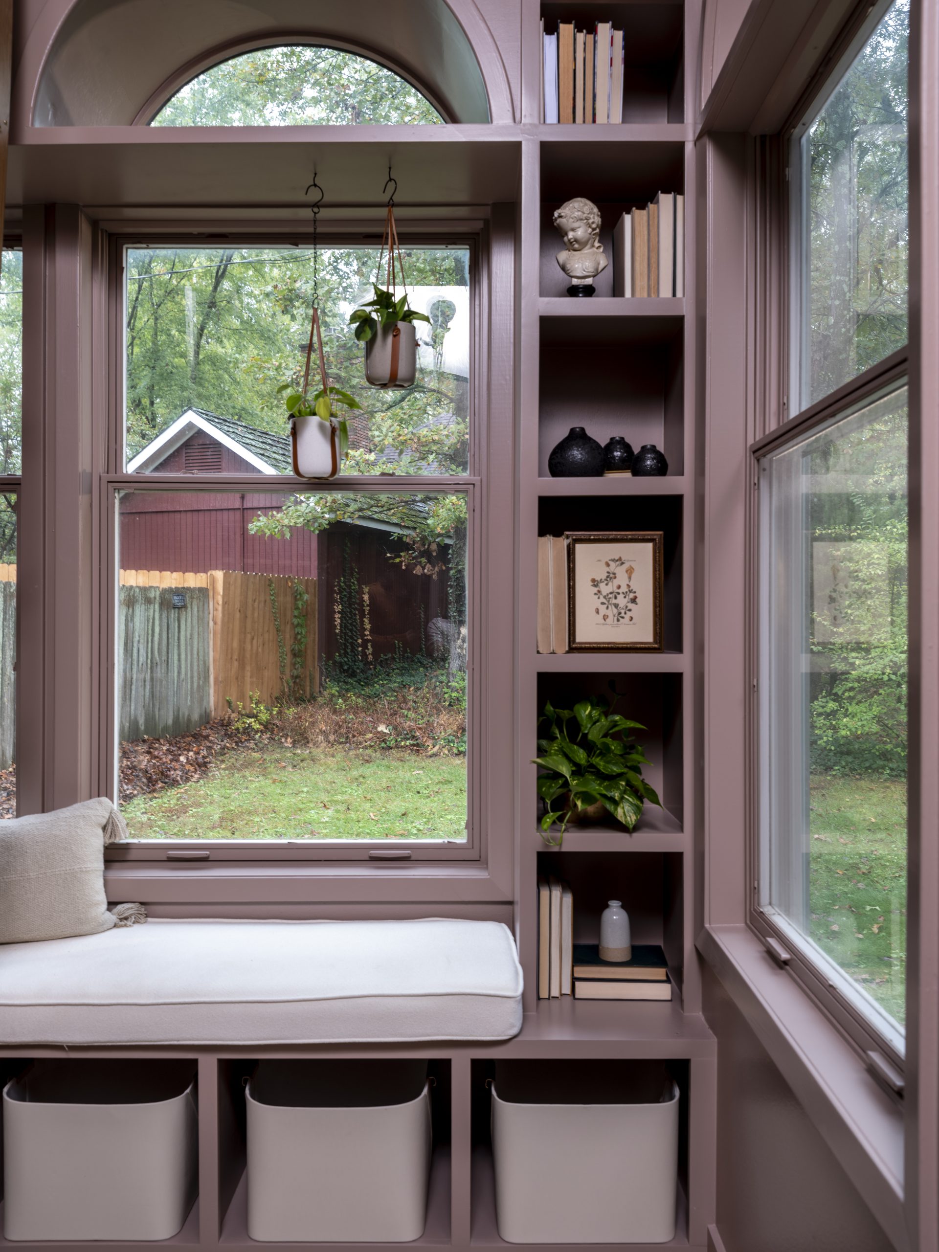
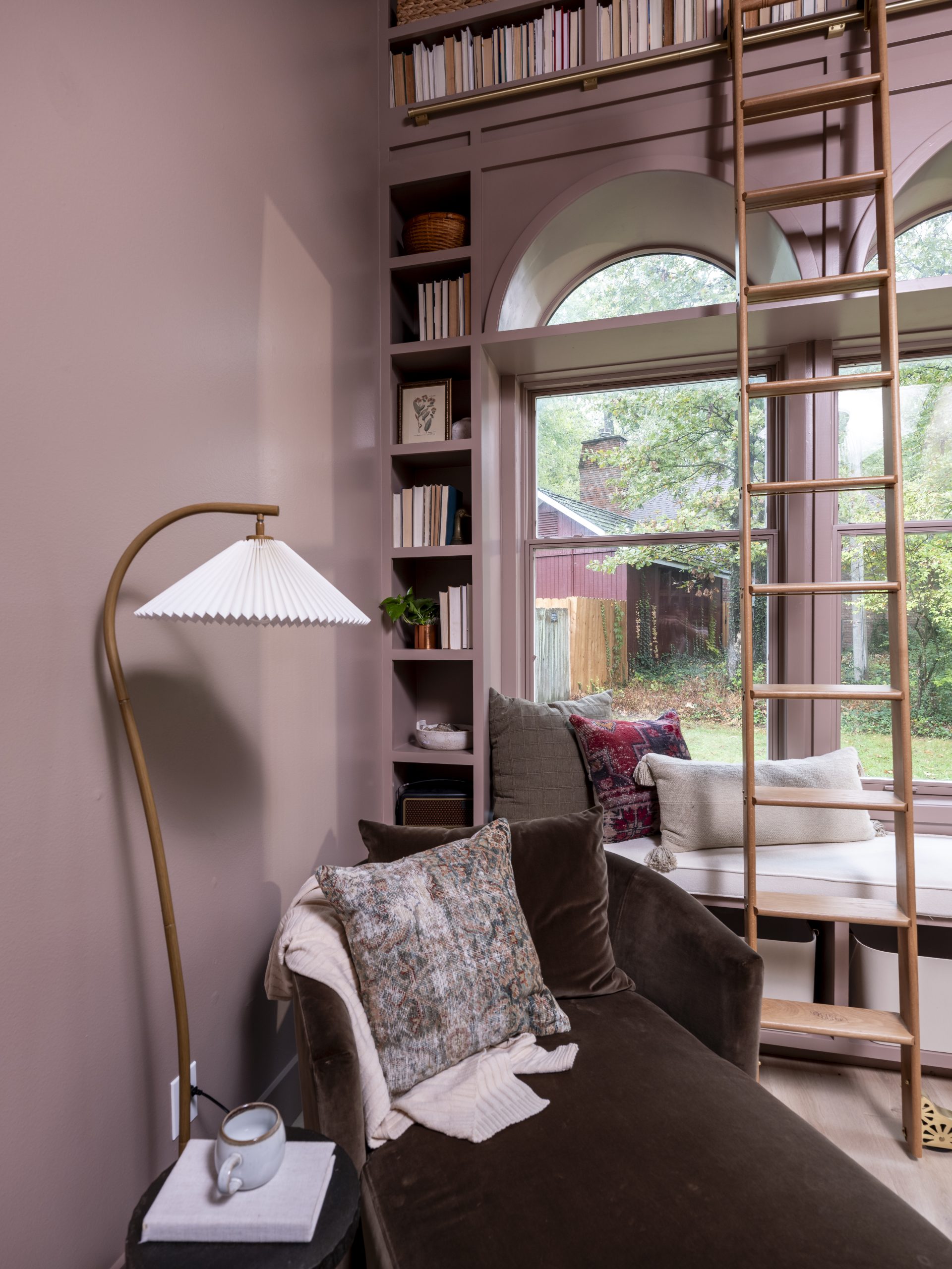
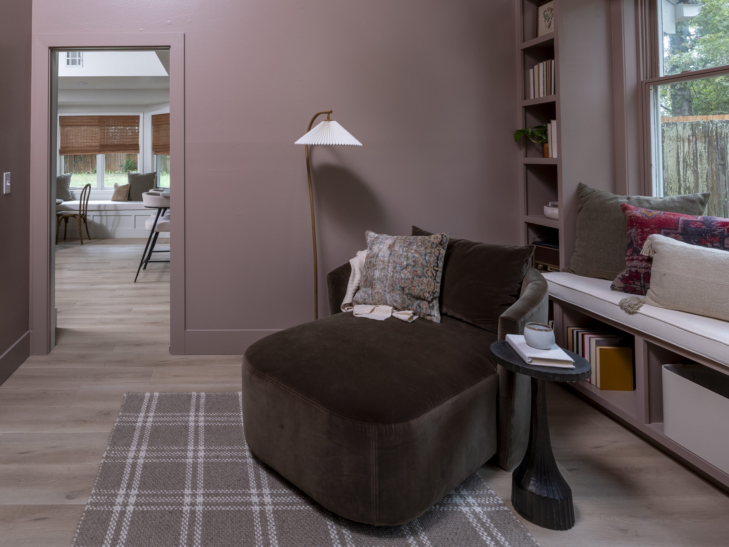
Originally, this was a dining room that wasn’t being used. Renee asked us to turn it into a library. The high ceilings and arched windows made this the perfect spot for a floor-to-ceiling book wall with a rolling ladder.
We replaced the slider that leads to the courtyard with a new energy-efficient one and painted the entire room (including the ceiling) a soothing blush pink. Of course, this space called for a cozy window seat and a beautiful chandelier.
After
Sources
Main Bedroom
Before
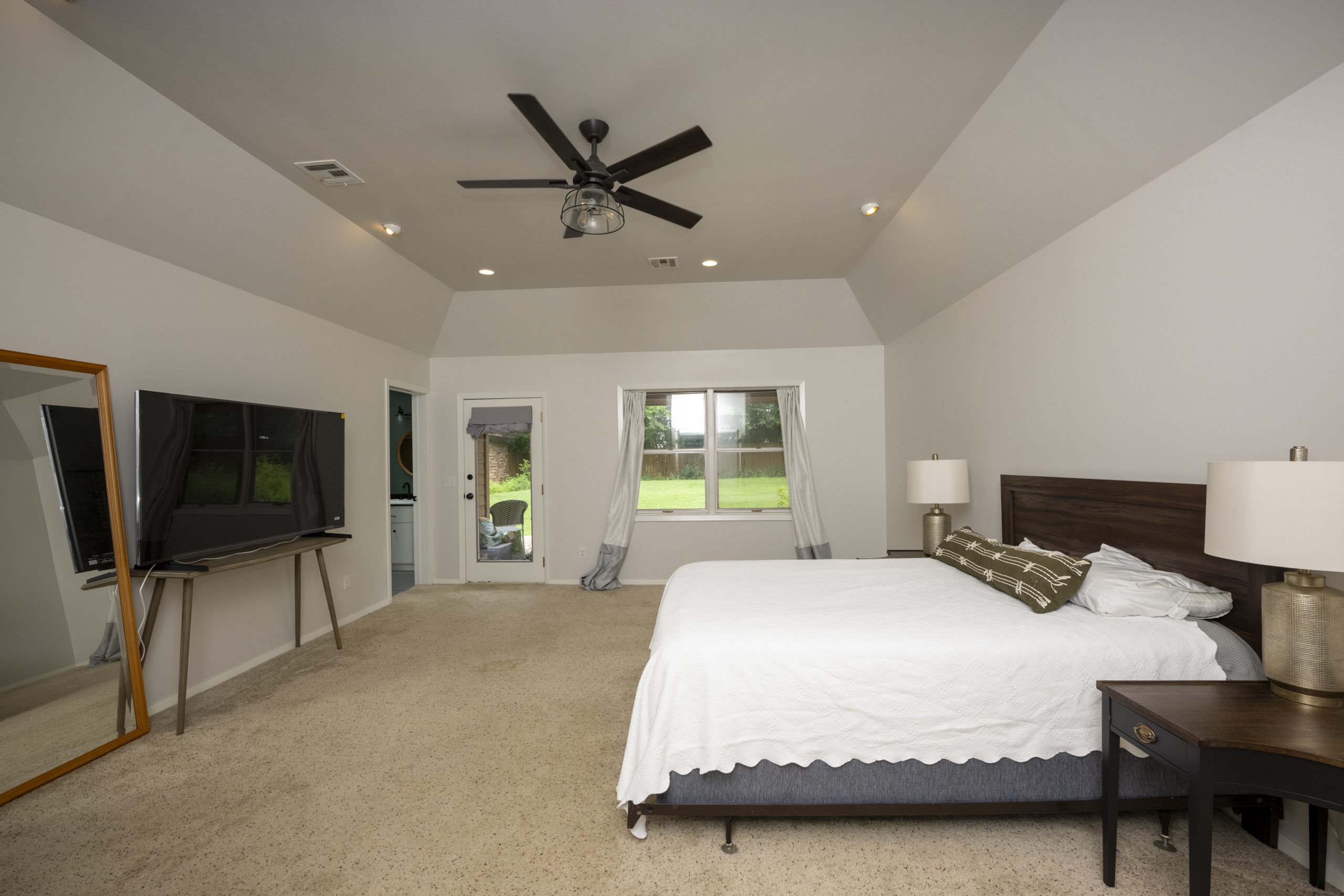
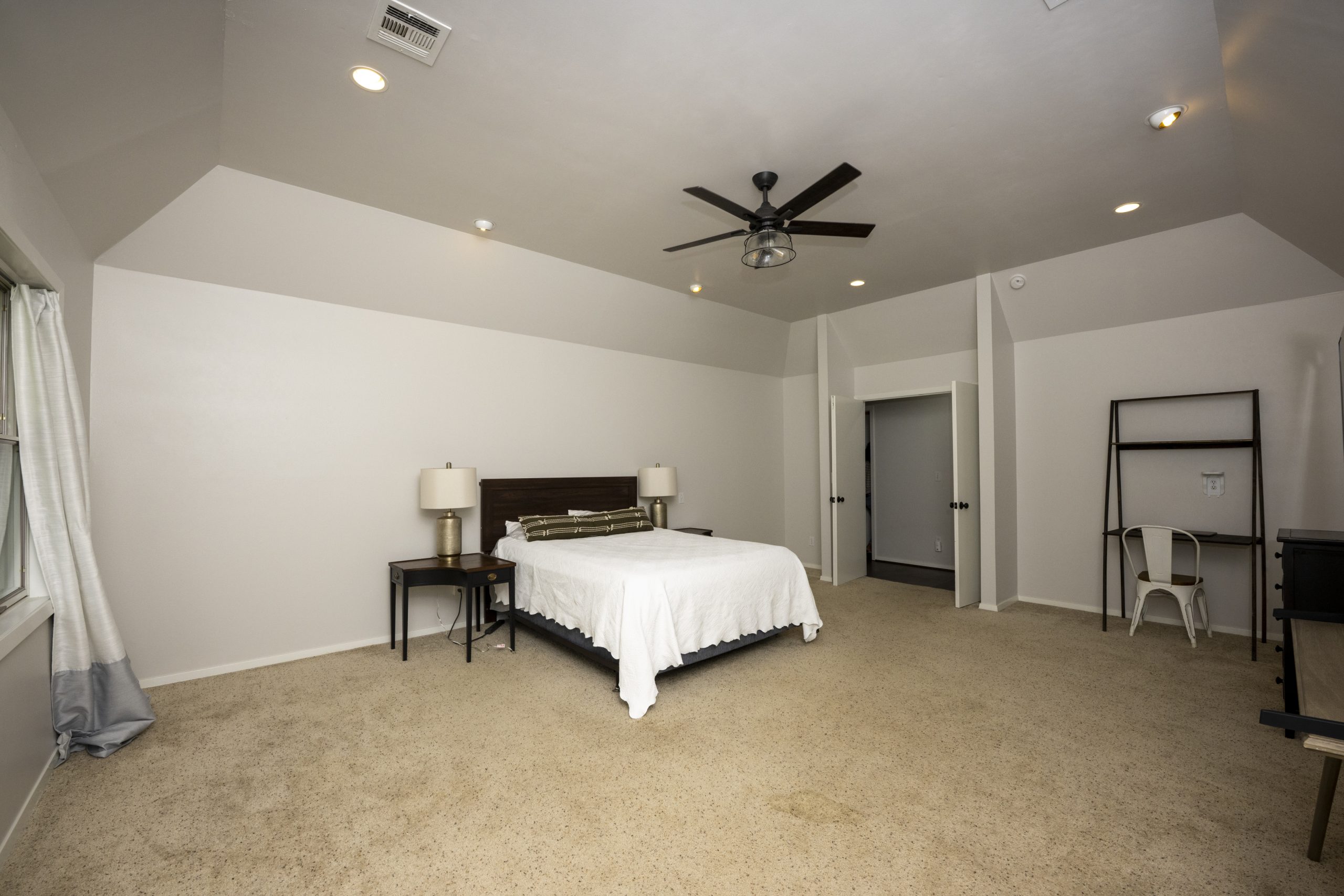
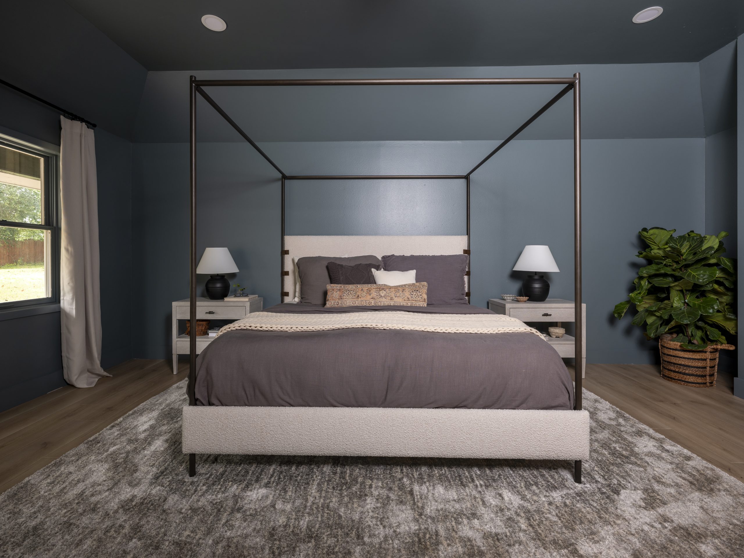
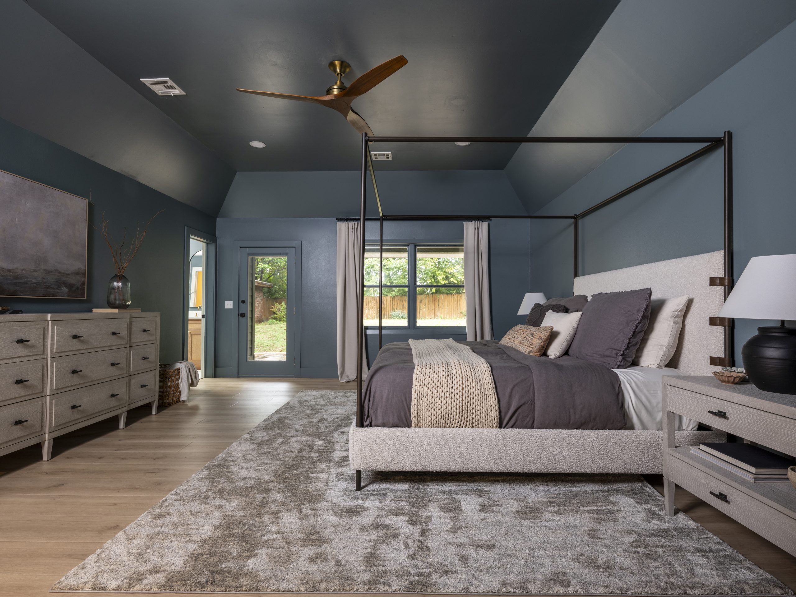
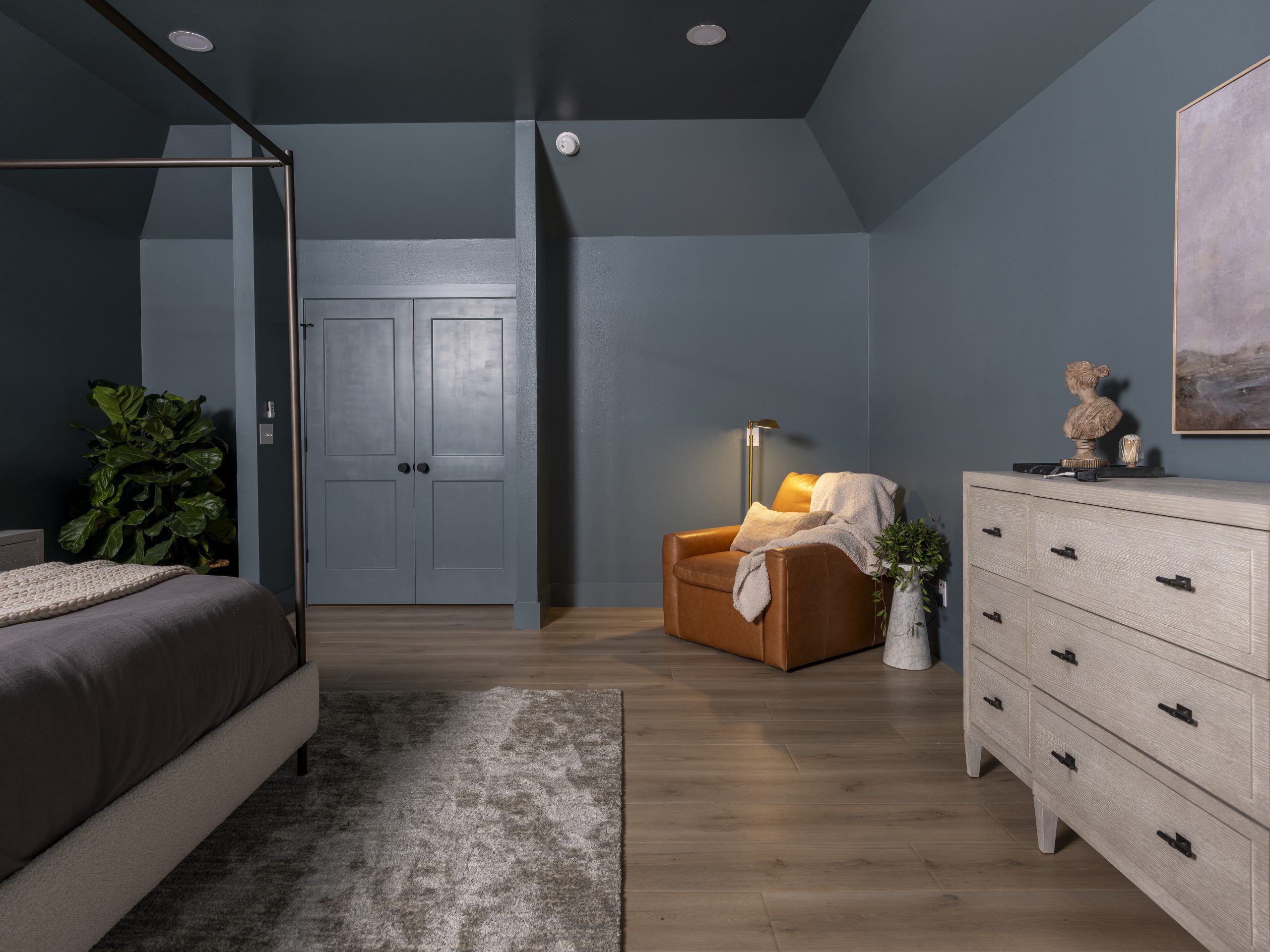
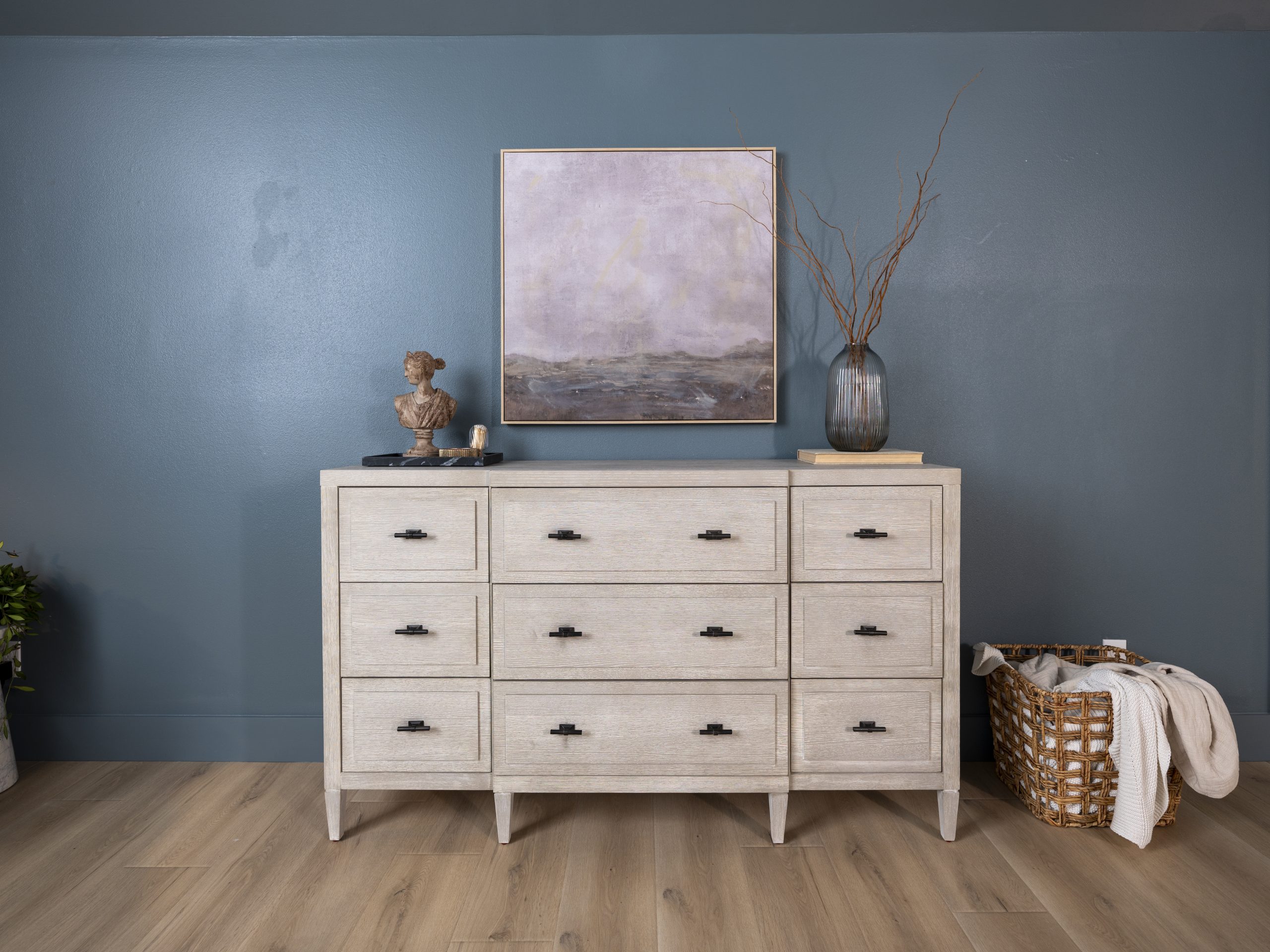
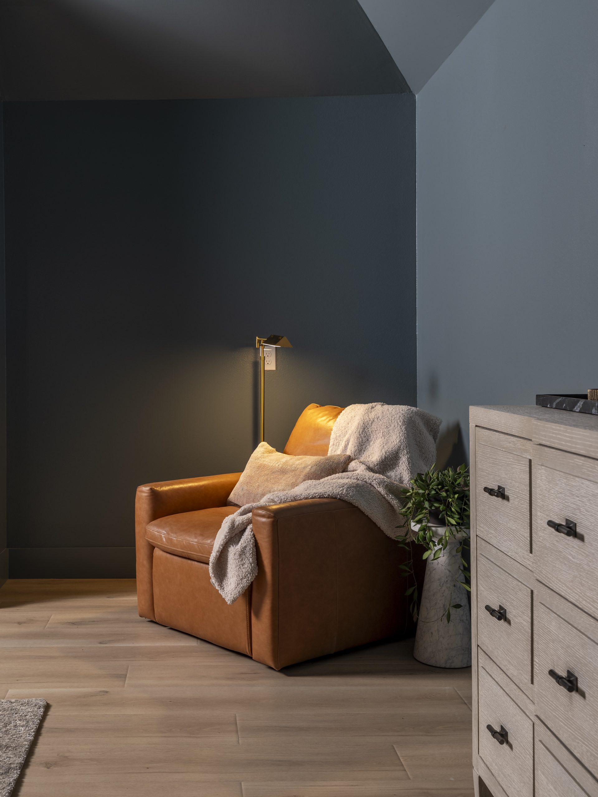
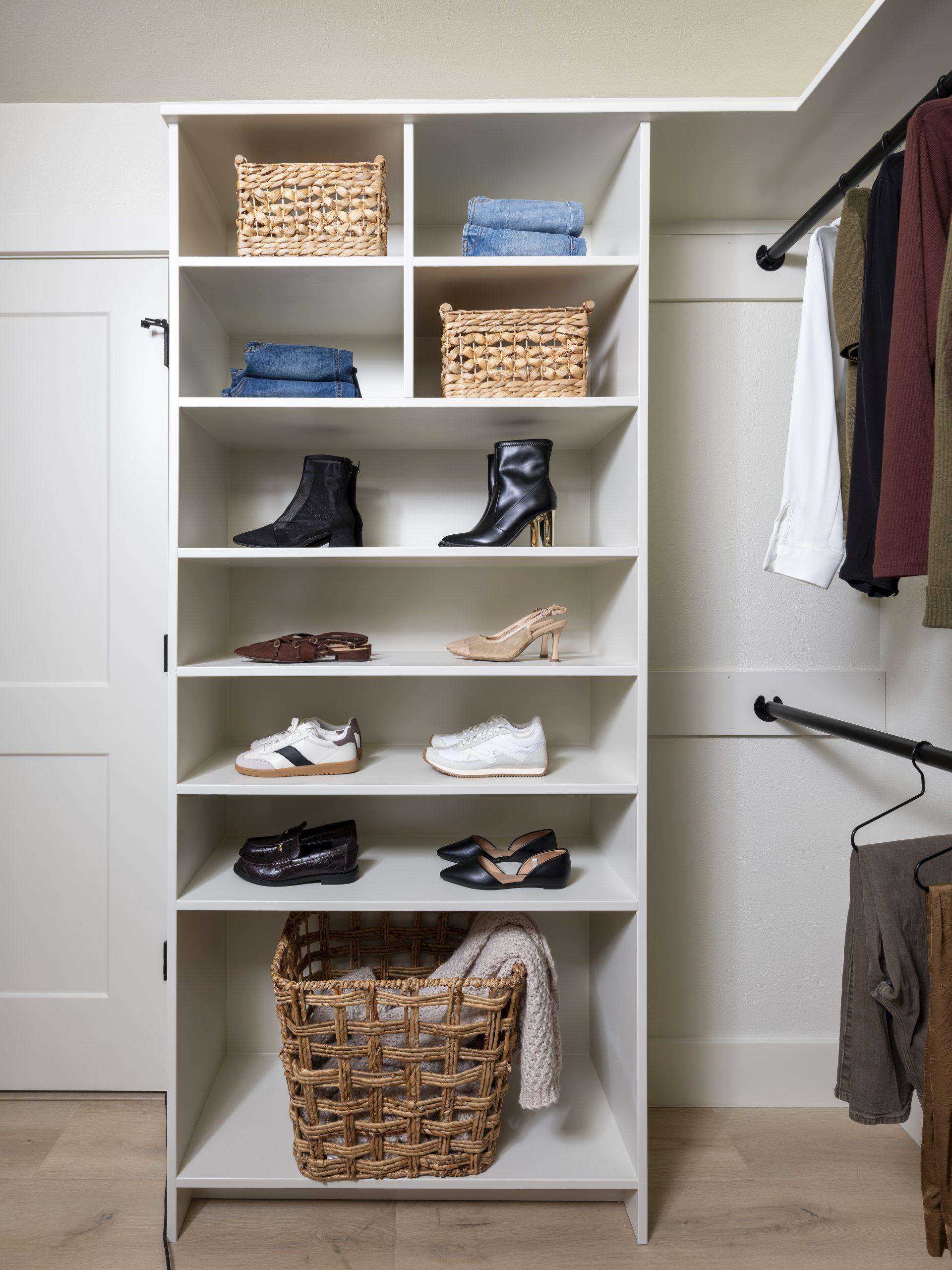
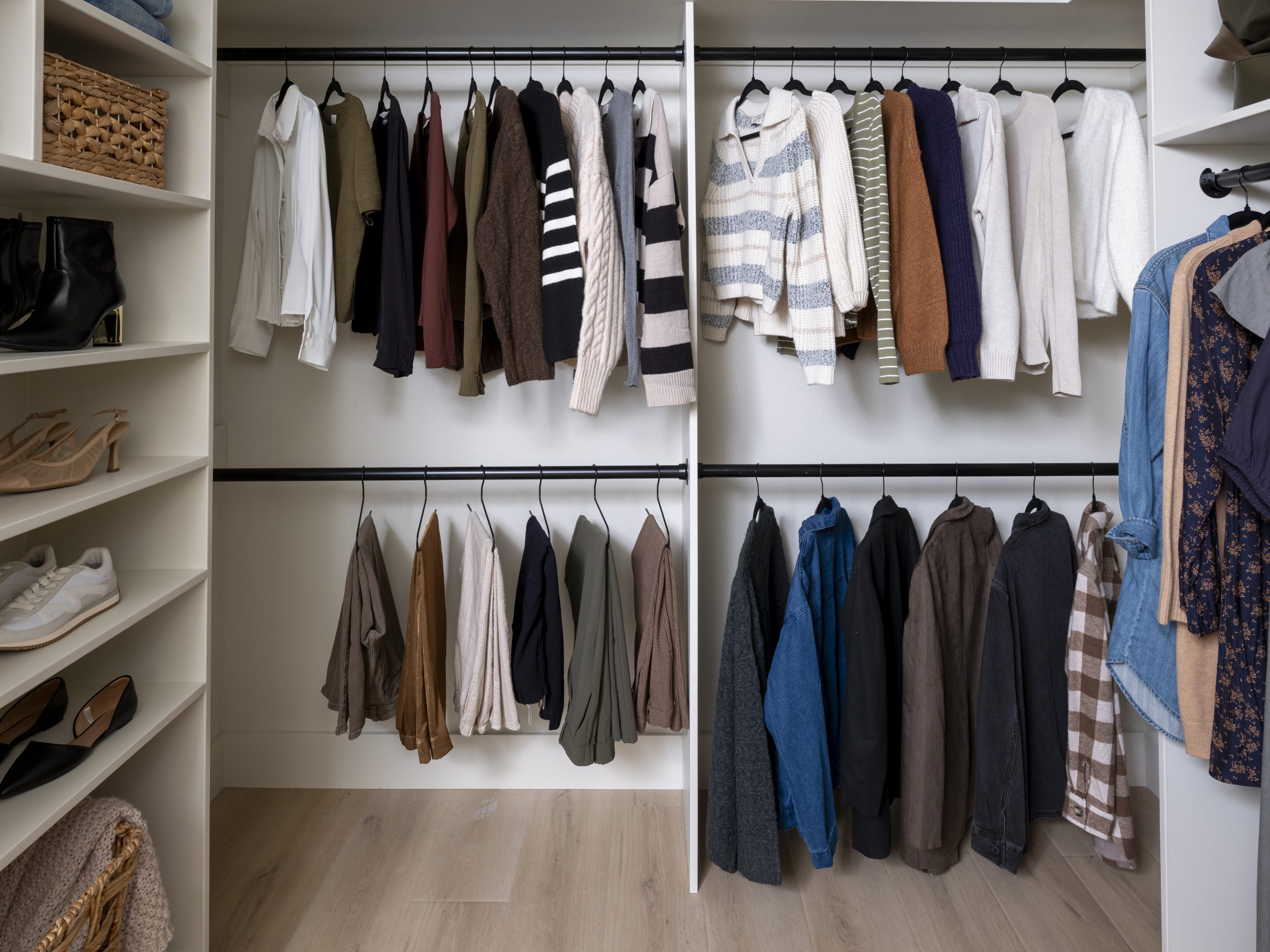
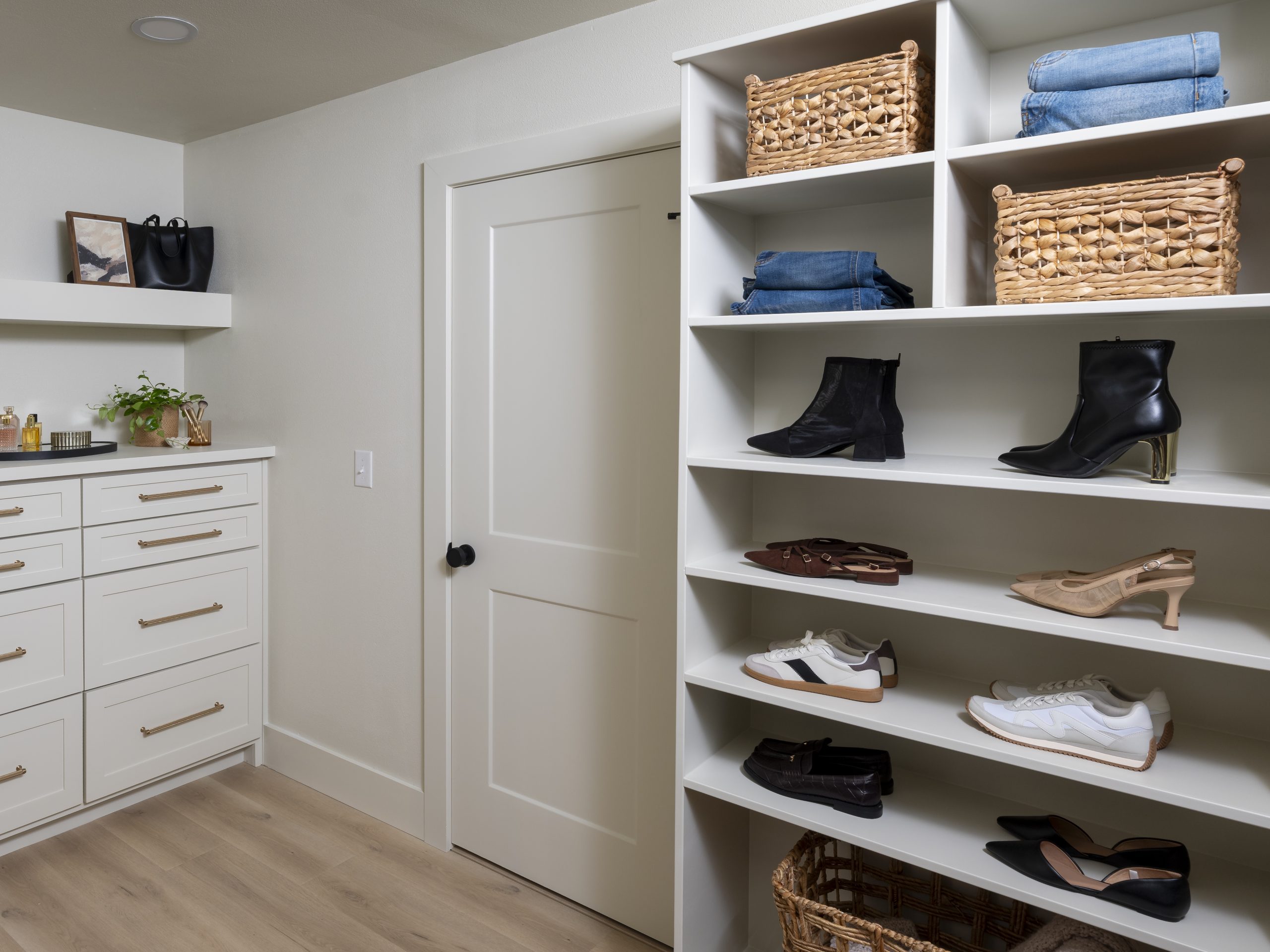
The room was carpeted and felt bland. The closet was small, with its door located all the way on the opposite side of the long bathroom, so improving access was a priority. Painting the room a darker color, replacing the flooring, and updating the furniture were simple, cost-effective ways to refresh the space. These changes made the room feel more restful and much cozier.
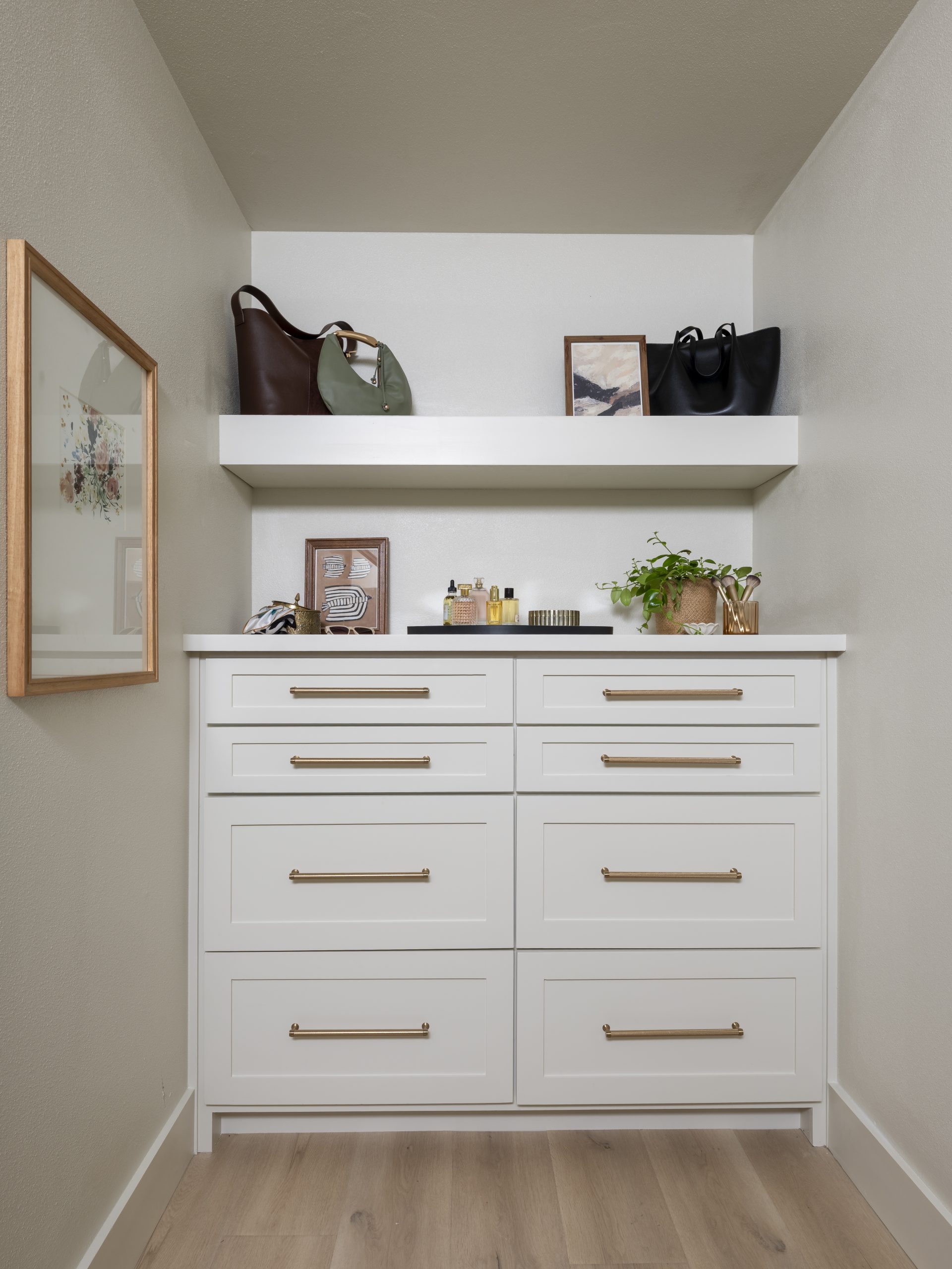
To make the closet larger, we borrowed space from the guest bedroom next door and added built-ins, including a built-in dresser. The result is a bedroom that feels updated, elegant, and still timeless.
After

Sources
Main Bathroom
Before
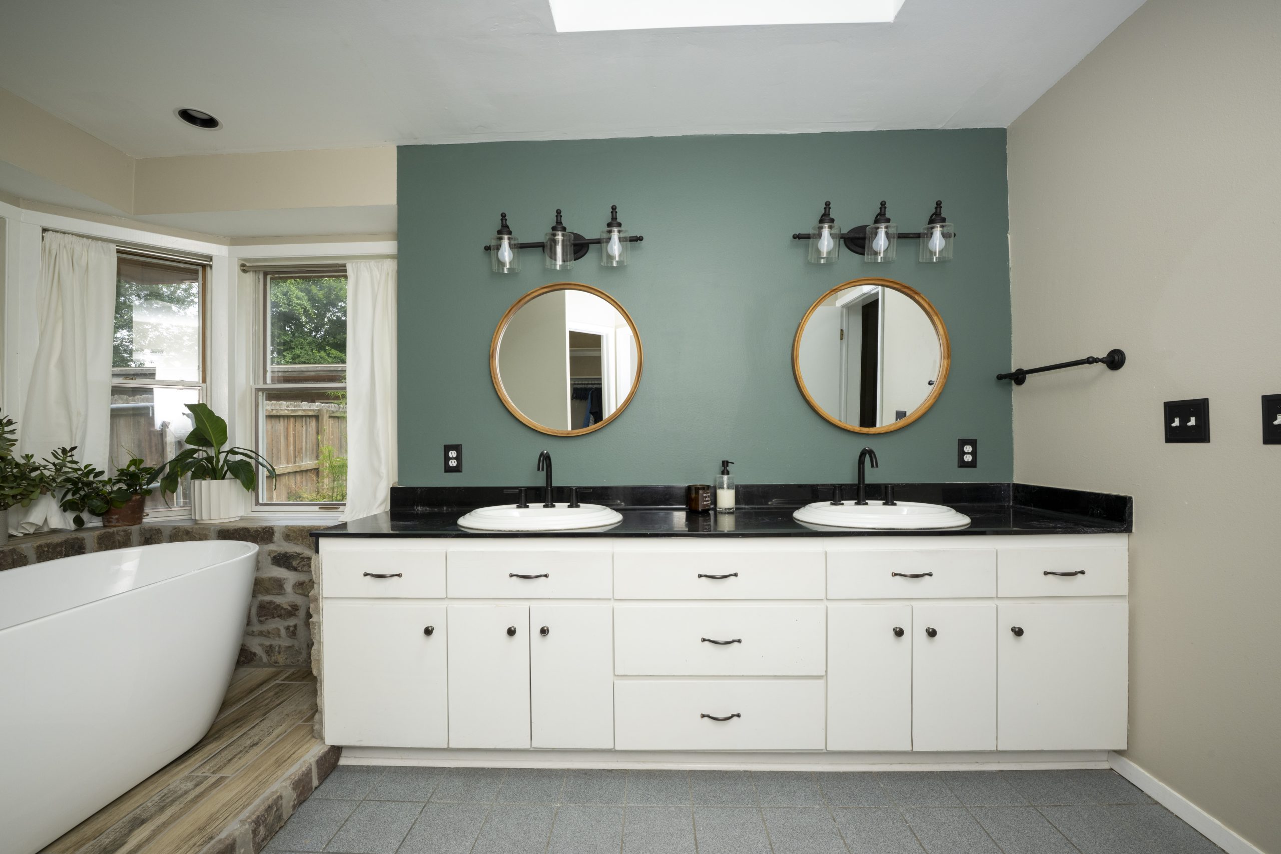
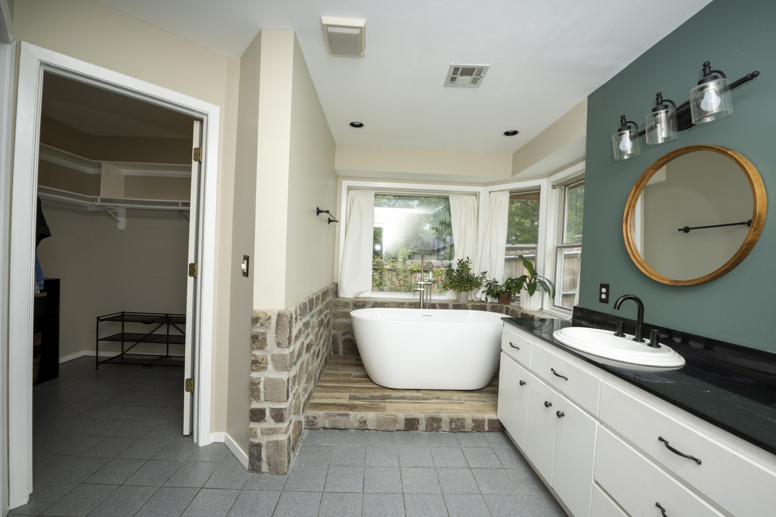
The skylight filled the bathroom with natural light, but the rest of the space felt dated, and the shower was far too small.
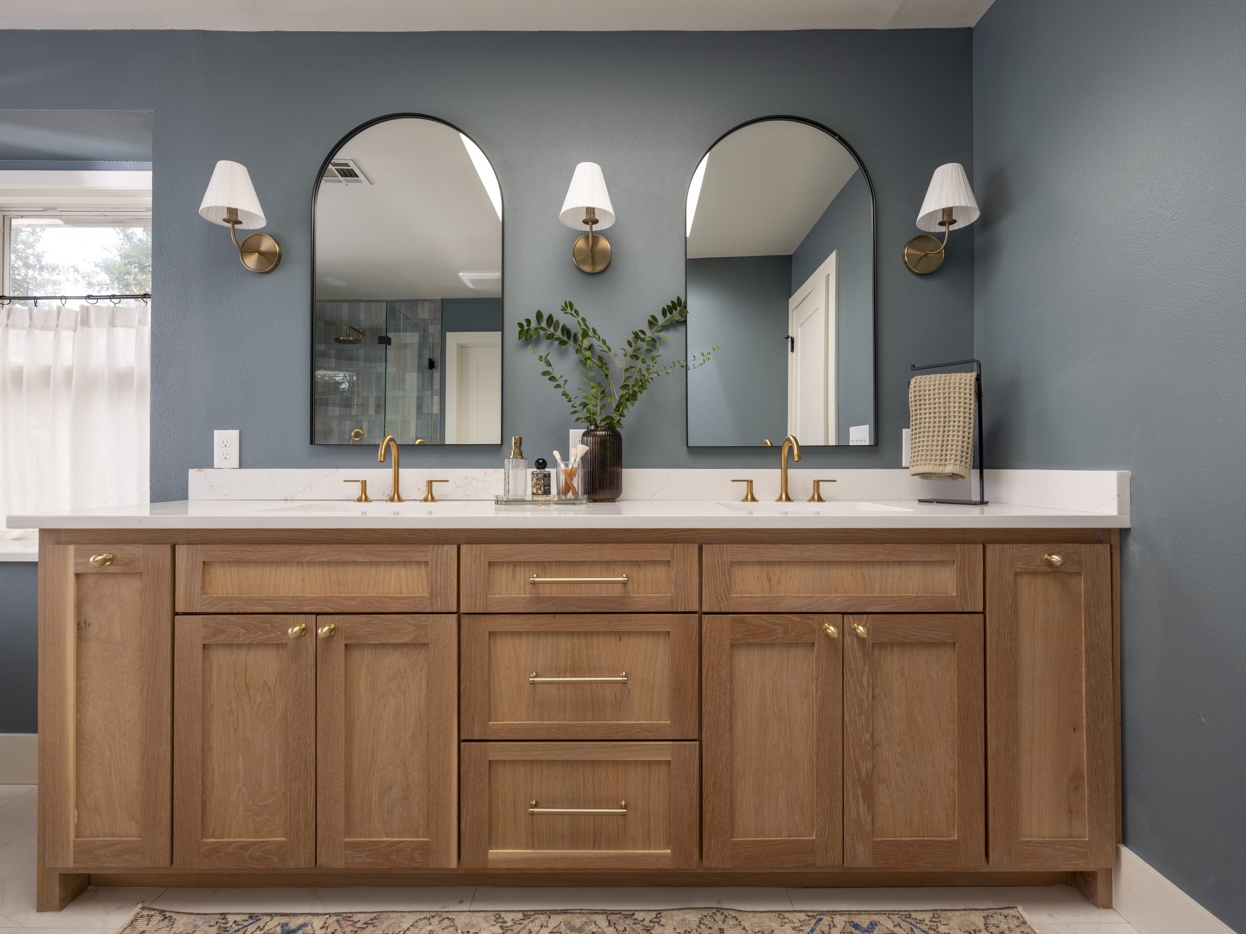
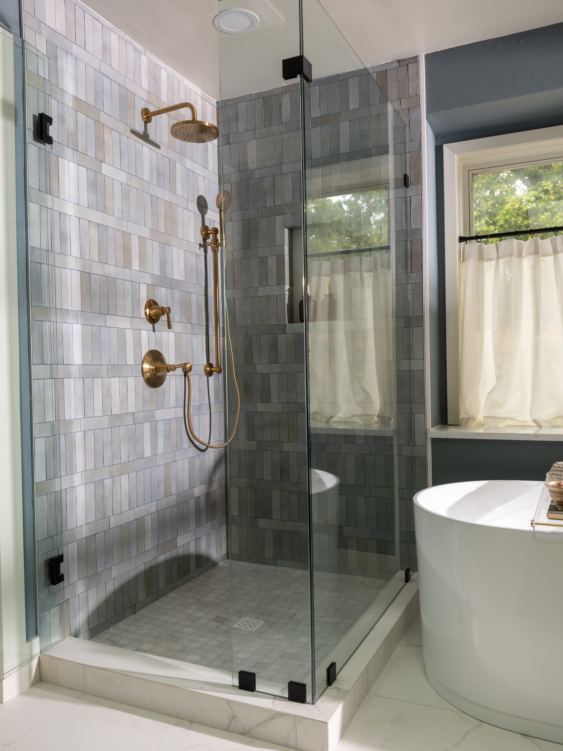
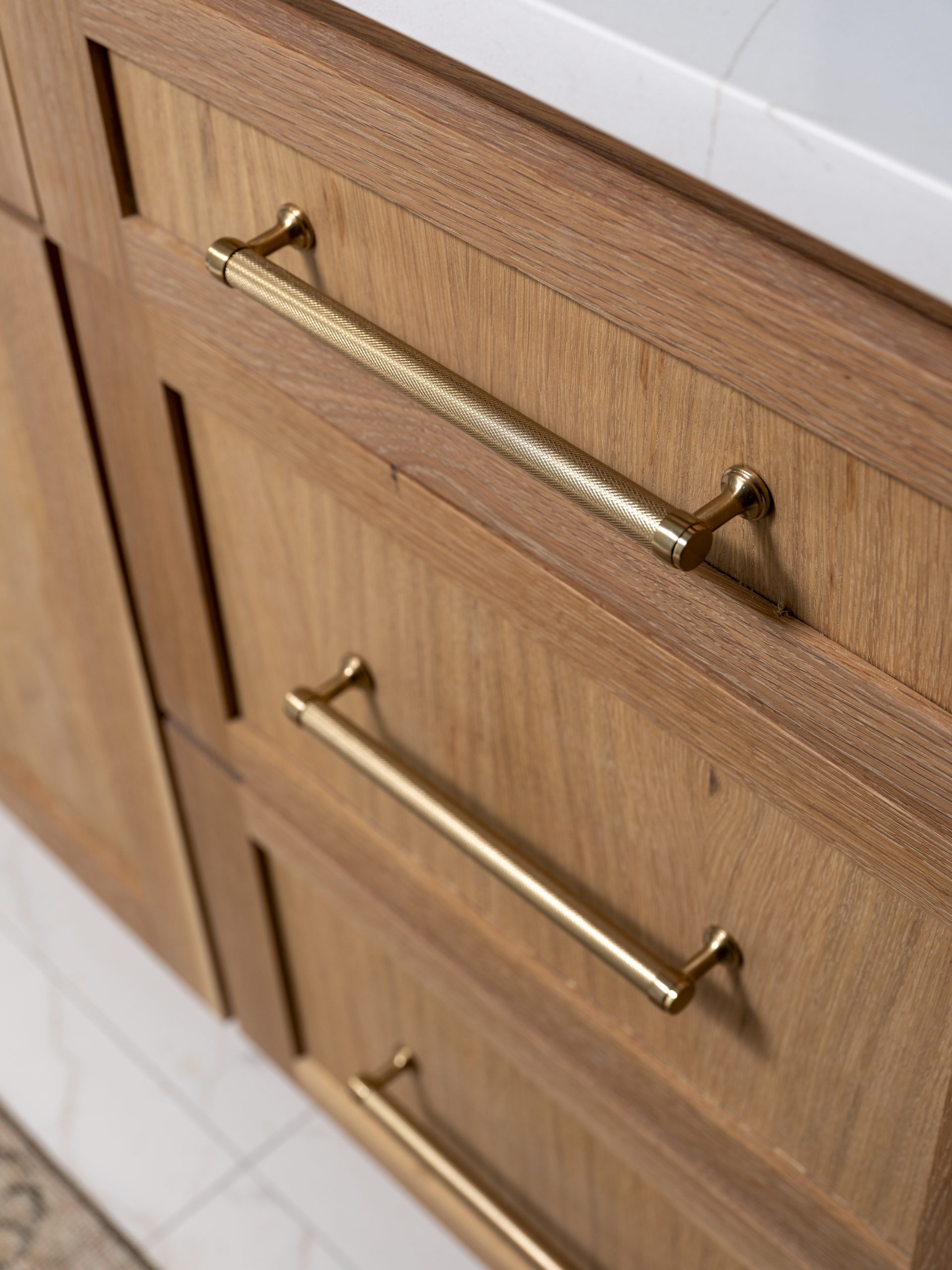
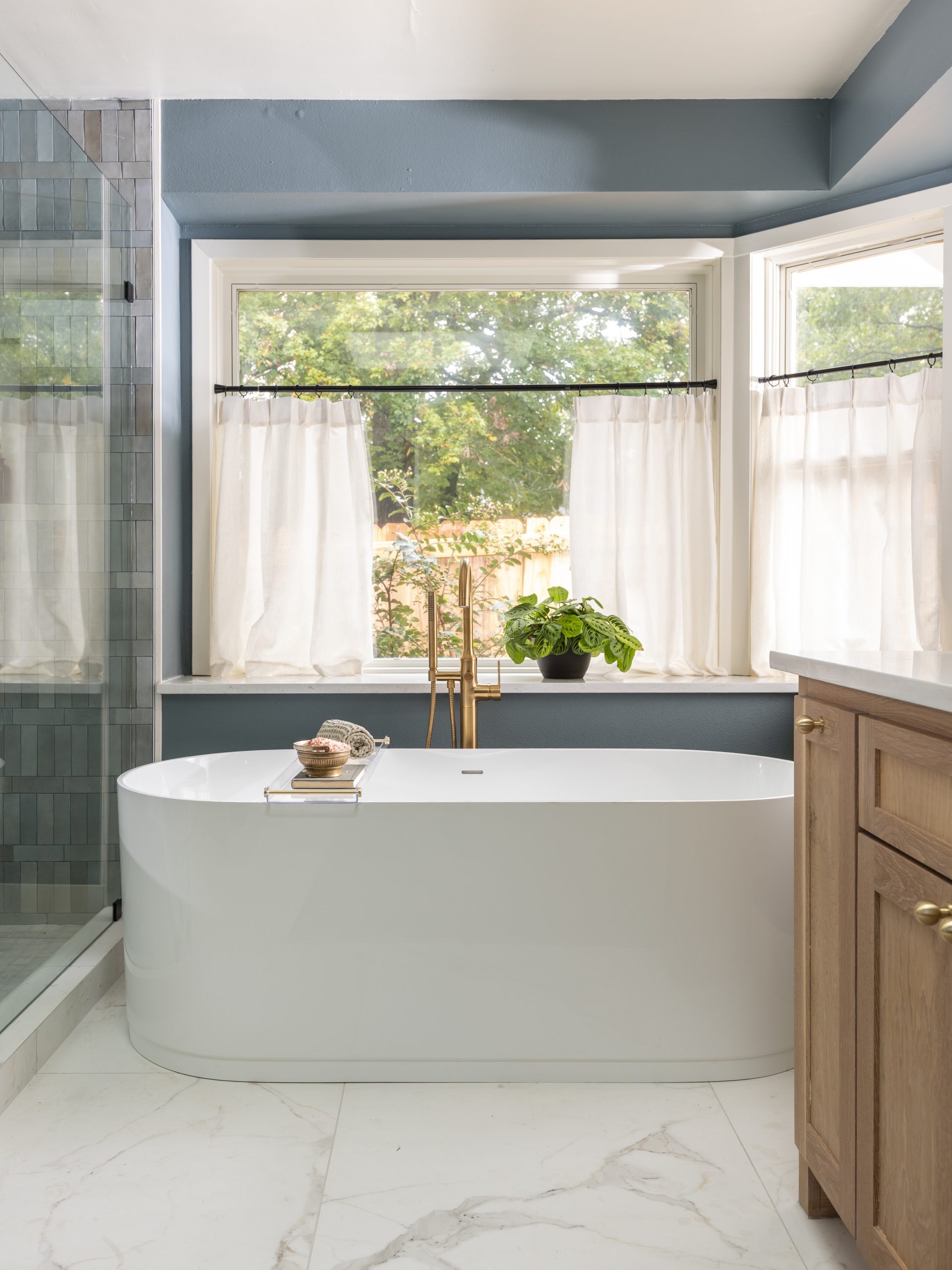
We kept the location of the bathtub and vanities but replaced them with styles that better fit the home’s transitional design. To improve the layout, we moved the shower to a different wall and rotated the toilet, which allowed us to make the water closet smaller. Did you notice the toilet in this episode? It makes a fun sound when you walk up to it and automatically lifts the lid.
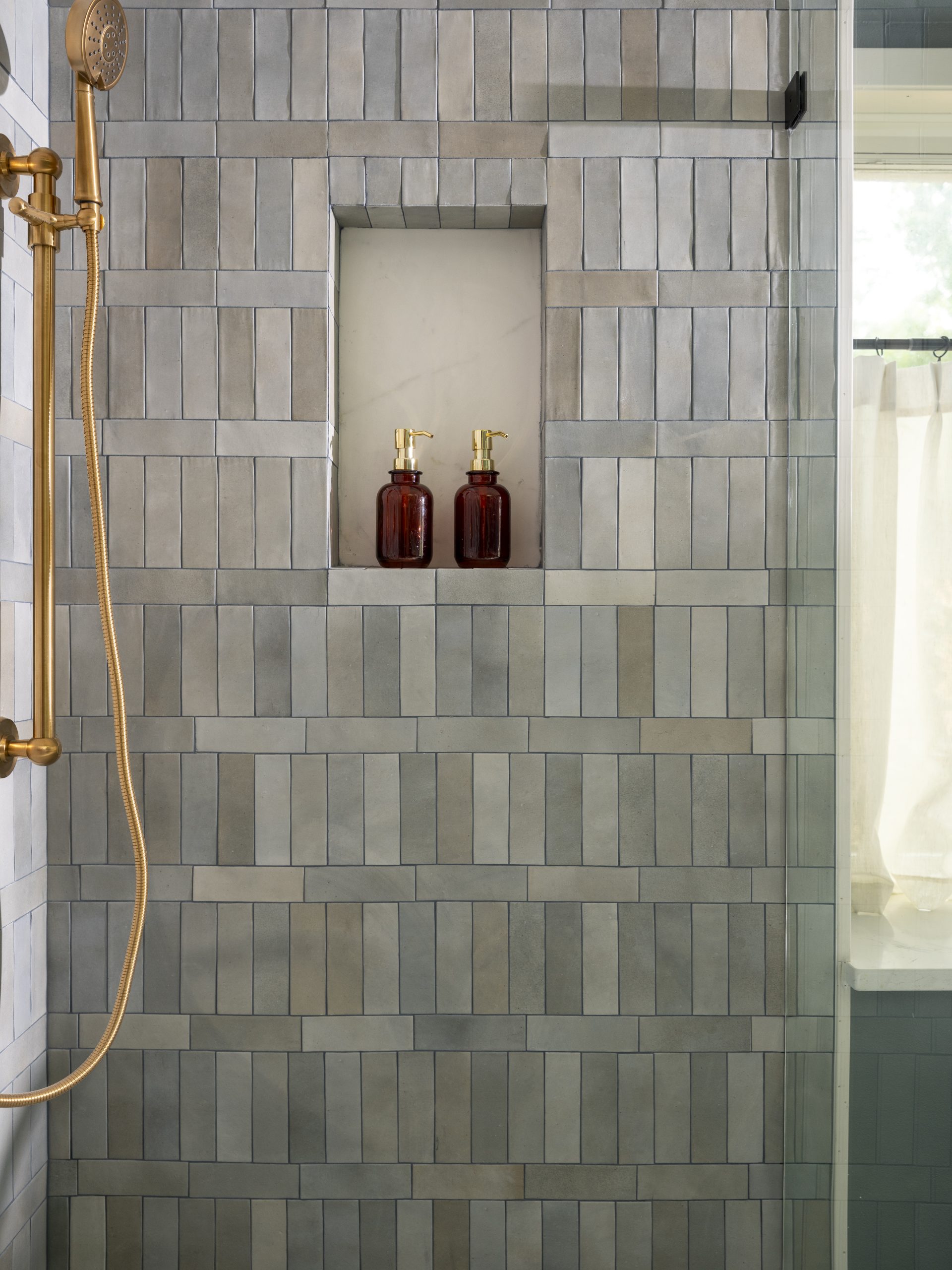
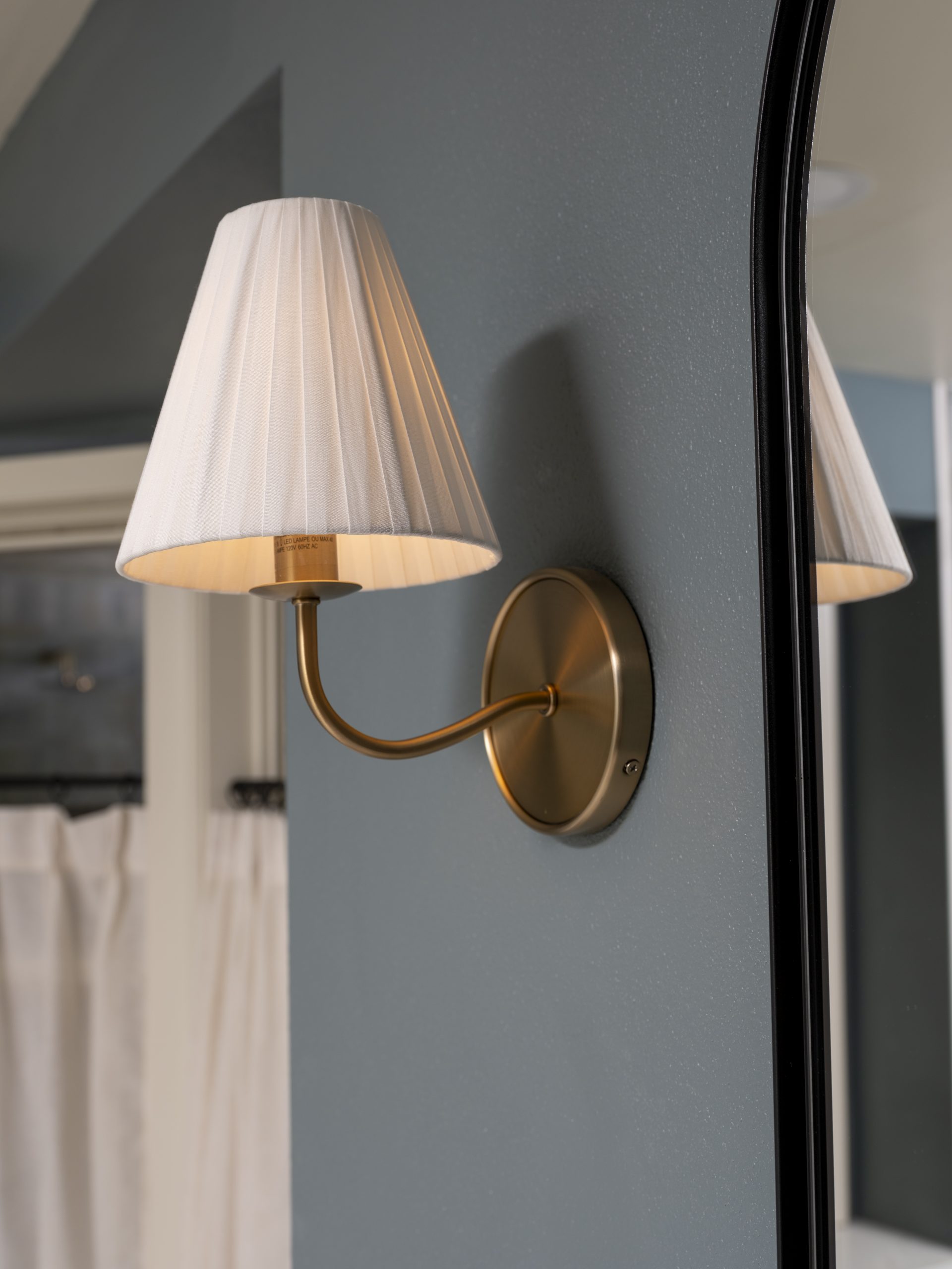
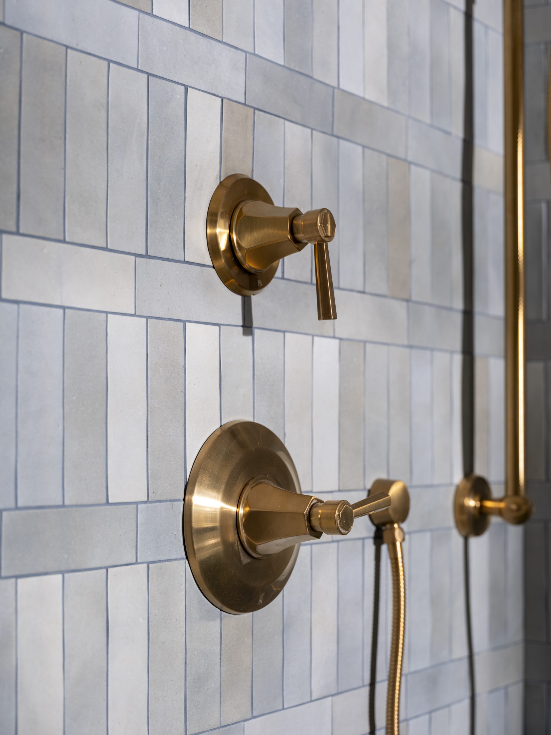
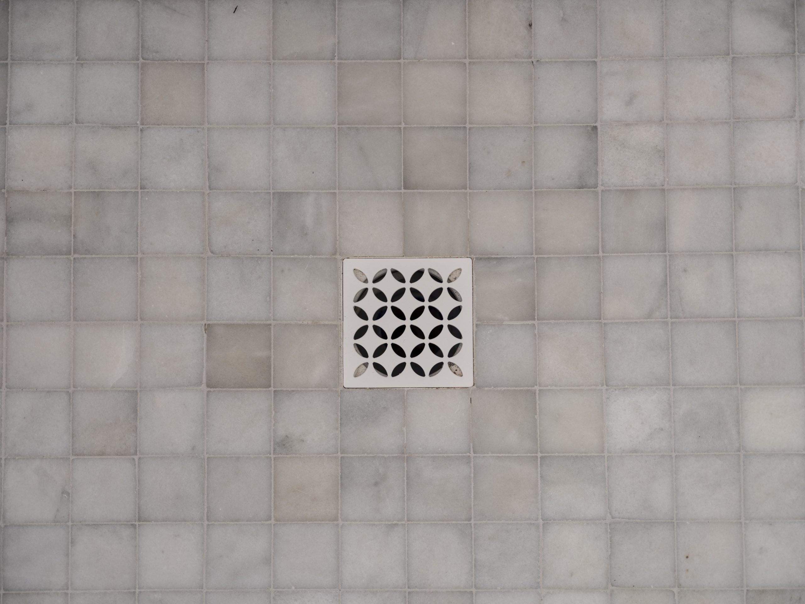
In the shower, we soldier-stacked the tile with a row running through the center. The gray shower tile pairs beautifully with the deep blue paint on the walls, which has subtle gray undertones. The gold finishes we added throughout the bathroom feel feminine and luxurious.
Now the bathroom feels calm and serene.
After


Sources